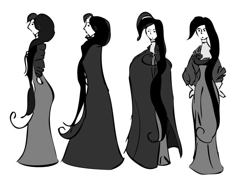
Som Sheet, Scan #1

I continue the parade of character sheets from yesterday.
Recall that I mentioned scanning the sheet at both 300DPI and 1200DPI, the result of the lower-resolution scan is what we will examine today. After scanning the sketch, I opened Photoshop and adjusted the levels (Image > Adjustments > Levels or Image > Adjustments > Curves) to give the inked lines a rich black look. Then I placed the image into illustrator and set the program to live trace. The benefit of live trace is two fold. Illustrator inks much better than I. The results smooth out many of the “shaky hand” errors, closes up gaps, and gives the image a much more unified tone. It also allows live paint, which turns coloring the work into a paint-by-numbers process of picking a swatch color and then clicking to fill the spaces inside the contour lines – much less time consuming than shading with ink washes.
Three problems immediately became apparent.
First, fine details such as the faces disappeared. This required a good deal of fine tuning of live trace’s “threshold” option. If I pushed the threshold too high the thicker lines became massive black smudges that lost much of their details, but if I dropped the threshold too low smaller lines disappeared. The result was a balance of the two extremes that failed to adequately capture the details of the original inking.
Second, live trace smoothed over much of the finer line arcs. This is most noticeable on the two center characters. The profile version loses the arc that defined her upper lip, creating what looks like a single curve from the tip of the nose to the chin rather than two smaller arcs. The face of the forward character loses definition in her shape. The original image showed the left-side of her face having much sharper angles.
Third, and this became evident only once I began live painting. The loss of finer details meant that many of the lines no longer connected to create enclosed coloring areas. The live paint process thus became much more tedious as I had to either fine tune the gap-fill, or go into the pen tool and move many of the lines closer together to enclose gaps so that I could easily color.
The solution? Quite easy, but I’ll get into that tomorrow. . .