August 01, 2012
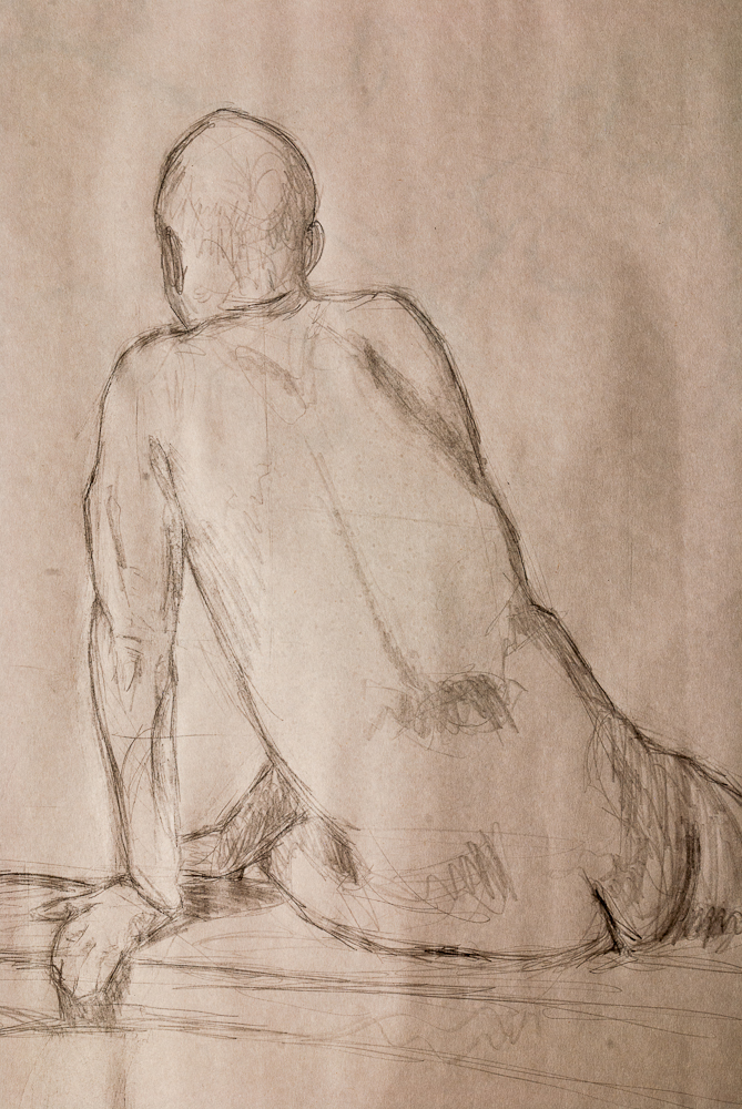
Life Studies #1 & #2
I’ve been attending a life-drawing studio in Sioux Falls over the last year, below are a handful of sketches that came from these studios.
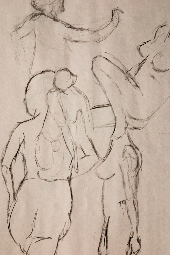
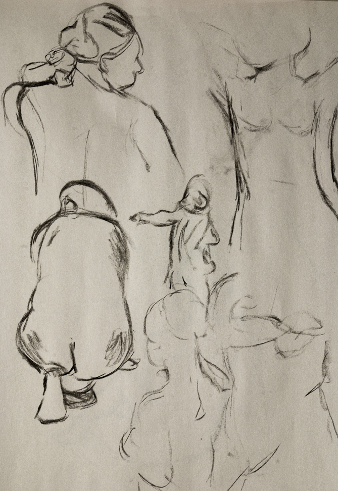
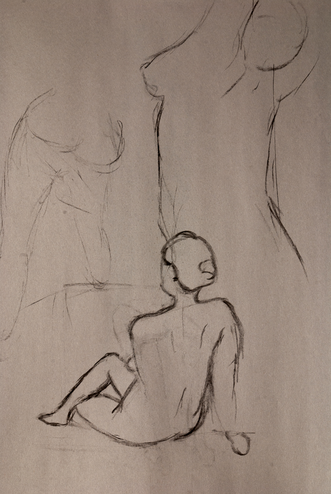
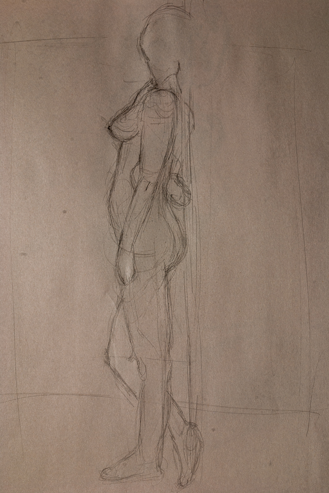
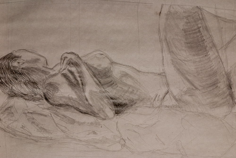
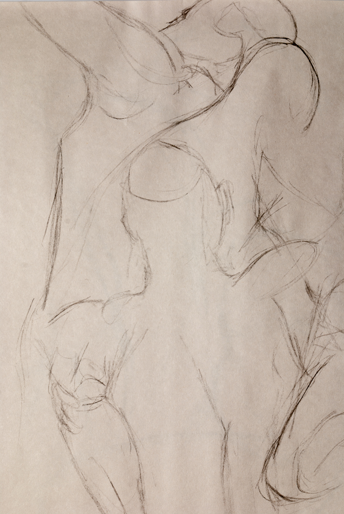
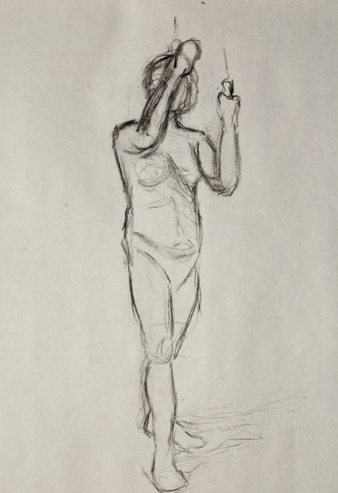
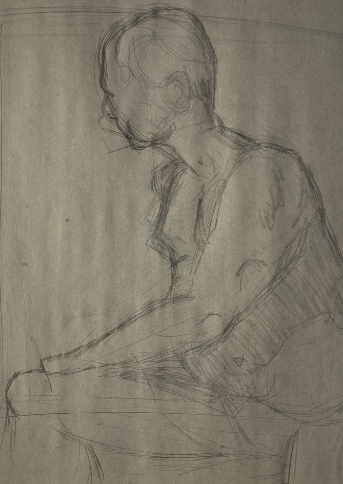
I’ve been attending a life-drawing studio in Sioux Falls over the last year, below are a handful of sketches that came from these studios.
The concept of feature creep is pretty well understood in the tech community. But I wonder what we would call the opposite? Feature decay? Feature half-life? Feature death?
Since I started working full time in the tech industry, I have had precious little time to devout to revamping my personnal sites. This makes me sad, because I have learned so much and yet have no time to apply any of this newfound knowledge to these little side projects!
So I set out with a plan. New templates for the portfolio and the webcomic. Also, I would spin my “Photo Journal” posts off into a seperate site tied into Fotomoto and attempt to market prints off of it.
Well, right from the start things hit a rocky start. If I wanted to do a photo website, I would first need to sort through the back catelog of 10,000 photos and figure out what exactly I could feature on the site.
Two months of sorting, tagging, scoring, and fixing up photos later – I concluded that (a) I was sick of editing photos and (b) I was not a productive enough photographer to populate an entire site with quality photographs.
So scrap that idea. How about doing the new templates? I set that on my agenda and watched the weeks pass. The problem? Every night I get home and the last thing I want to do on a summer evening is sit down at the computer and do more coding.
The end result was a massive descaling of the project. Instead of all new templates, I went for fixing up some of the padding and font issues on the sites. This site went to a sans-serif font and added Google Ads to the blog page. I also updated the photography page with new photos from late 2010. My resume is now up-to-date and I scrapped the website design / development portfolio pieces because they were out of date and with how rapid my skillset changes these days, I doubt I could keep up.
The the comic site also got a big rebranding as I changed the name from “Drifting on the Sea of Nihilism” (a reference to the ongoing story I was trying to tell) to a more generic “Dreamscapes.” I archived the tale of Ivan and filtered out the filler art into a sketch blog where I plan on showcasing my current attempts at bad art. Ivan, may continue or I may spin off into working on a different story. The backend of the wordpress template is rather new. I can now create storylines that will allow pagination one comic at a time instead of having all of the entries piled into one long feed.
So there we are, very ambitious plans turned into “change some fonts and rearrange the feeds and call it good.” Ah well, at least I can check it off the list of summer projects.
I came across a used macro lens for sale recently. I’ve had an eye out for a macro for some time, but they are one of those specialty kinds of lenses that don’t seem to be for sale used in the same bulk as consumer kit lenses or ultra-zooms. Here’s the results of my first real test of the lens:

Model: Nikon D80 /w AF Micro-Nikon 200mm f/4.0 IF-ED
Shutter: 1.3 sec
Exposure Program: Manual
F-Stop: f/18
ISO: 400
Focal Length: 200mm
Lighting: None
And for those of you who would like to see it blown up to 100% we can really see the details that macro photography allows:

Okay, Portal 2! What could be said about Portal 2 that wouldn’t already be known by anyone who stumbles upon this blog?
Portal 2 is amazing? That’s a given since this is a product of Valve we are talking about here. Valve just does a very good job on it’s games and Portal 2 is no different. This is a product that has been polished until not one little error remained. Every line of dialog is a pleasant suprise, every puzzle an innovative joy and I am only sad that it is so short.
For those who may have been laying beneath a rock – Portal 2 is a first-person puzzle game built using Valve’s Source engine, that is the same engine responsible for the likes of Team Fortress, Left 4 Dead, and Half-Life 2. Except instead of focusing on run-and-gun gameplay, Portal uses the first-person perspective for an entirely different take. Your gun shoots portals. Left click and it sets an entrance on a wall. Right click anywhere else and you create a doorway that will take you from one space to the next.
It’s like playing in an M.C. Escher painting and the challenge is simply being able to visualize the problem of moving between point A and point B. At first this is rather simple. Shoot a portal on a wall, put another one somewhere else and hop through. But the puzzles become increasingly challenging as the game progresses requiring a great deal of creativity upon the player’s part to simply navigate the levels.
And as a companion to your trials you get a collection of some of the most delightful, twisted characters that I have seen in a game before: GlaDOS, Wheatley, and Cave Johnson exist to torment, mock, and serve up a kind of science-experiment-gone-wrong scenario as Chell (our protagonist) delves into the bowels of Aperture Science to uncover where it all began.
If I am beaming about the game it is because it is just that much fun. It has been a long while since I hit a game that I just could not put down and Portal 2 is definitely hard to put down.
 I
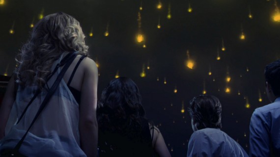
came upon the film Sunshine by way of the exemplar Moon. The latter being
perhaps one of the best instances of hard science fiction that we have seen in
theatres since 2001 A Space Odyssey. Sunshine, while a very good film, cannot
live up to Moon simply because of some very basic plotting issues. Nevertheless,
it is a very interesting science fiction flick.
I
came upon the film Sunshine by way of the exemplar Moon. The latter being
perhaps one of the best instances of hard science fiction that we have seen in
theatres since 2001 A Space Odyssey. Sunshine, while a very good film, cannot
live up to Moon simply because of some very basic plotting issues. Nevertheless,
it is a very interesting science fiction flick.
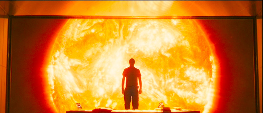
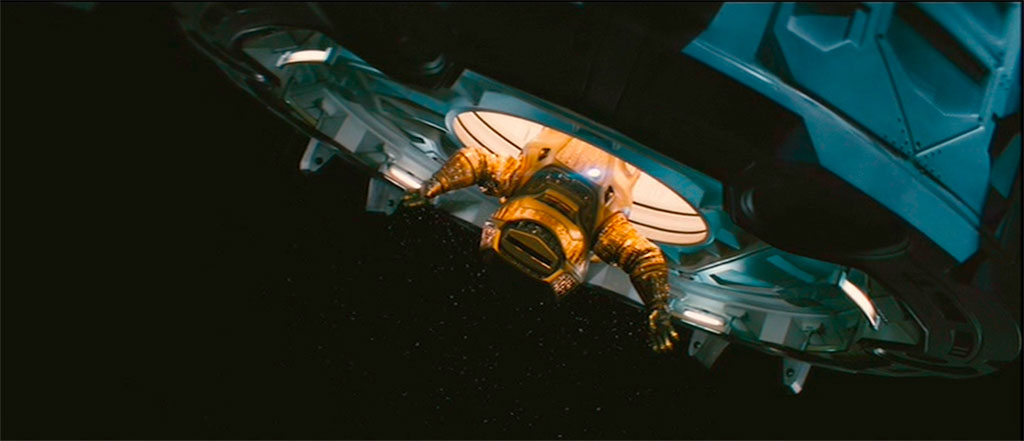
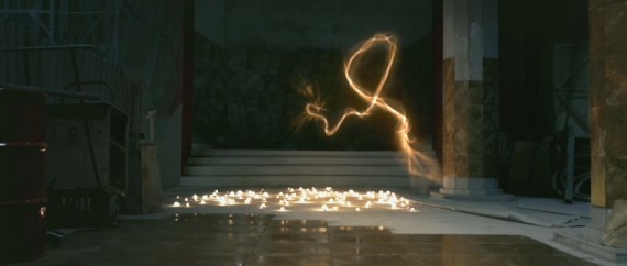
Sunshine works on the premise that in fifty-some years the sun’s light has begun to dim plunging the earth into an eternal winter. In order to revive the fires of the sun, Icarus was sent to detonate a payload with “the mass of Manhattan” into the sun’s surface. This mission, for unknown reasons failed. The film begins following the second mission (Icarus II) as it retraces the steps of the Icarus I in an attempt to follow up on the same mission.
This is decidedly a psychological film — one that draws upon many past science fiction themes of the lonesomeness and vastness of space and how this conveys the minuteness of humanity in the cosmos. It is particularly interesting how involved the main cast gets into the sheer importance of their mission and the willingness to throw everything away for their mission. That said, they are very human characters, not the machismo heroes of the action-suspense genre we often see out of Hollywood.
The sun, our antagonist, plays so many roles for our heroes as they address it both as a villain who threatens the ship and with a kind of spiritual reverence held by various pagan sun gods.
The very name Icarus seems to very important to understanding the film. In the old Greek myth, Icarus is the son of Daedalus the inventor. The two are imprisoned onCrete and in a stroke of genius Daedalus constructs wings for the two to escape the island by flying through the heavens. Daedalus warns Icarus that the wings are fragile and made of wax which will melt if he flies two close to the sun. Nevertheless, Icarus is too taken up with the excitement of flight and flies higher and higher until his wings melt and he plummets into the sea.
Herein we can see the fate of Icarus the ship — a work of technological achievement sent on a mission to visit Apollo himself. In flying so close to the sun, it chances total destruction by it’s firing furnace and only by a massive aspis-styled that reflects the sun’s light.
Returning the mythical elements, the crew seem to be in awe of the sun. They spend hours watching it’s furnace glow, talk reverently about it, and dream nightmarish dreams about it’s flames.
The only issue with Sunshine? Besides introducing the ridiculous cliché of an accidental oxygen shortage, the third act forgets who it’s antagonist is. The sun, such a perfect villain for a man-vs-nature plot is supplanted by the mad captain of the Icarus I who boards the ship and turns an otherwise amazing film into a run of the mill slasher flick. The captain, burnt by the sun’s rays, and having lived alone aboard the Icarus I for seven years believes the sun that the sun is God and that it has commanded him to abandon the mission.
While I can appreciate the sun-god motif in the film and the interesting questions that Sunshine brings to the table about how we have related to our star over the centuries — the rabid fundamentalist captain is out of place in this film. He suddenly interrupts our story and transforms it into a battle between science and fundamentalism or man-vs-man which is not altogether what we have been promised in the first two acts.
Indeed, the violence that the deprived captain inflicts upon the crew is a merger of horror into an otherwise fulfilling film. I do enjoy the occasional cerebral horror film. However, in Sunshine I was not expecting a razor-blade wielding maniac to suddenly appear and displace the sun from it’s dominant role of antagonizing our heroes and I do not think his addition adds anything to the film other than to pad it out an extra twenty minutes.
Despite the plotting flaws, Sunshine is an excellent example of how cinematic science fiction can rise above the empty plots ofHollywood action-suspense flicks into truly masterful pieces that explore our relationships with being. I highly recommend watching it.
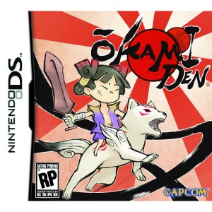
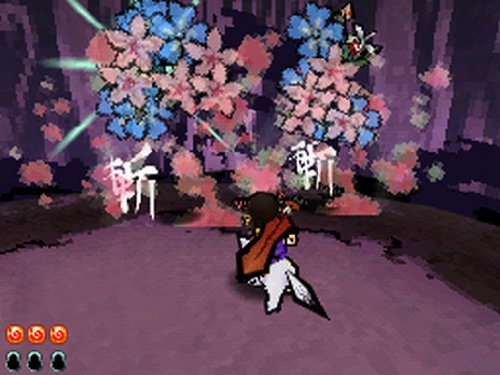
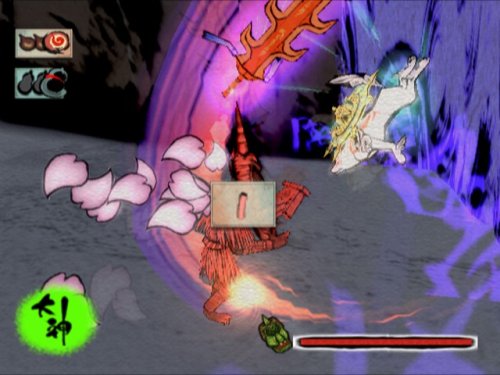
Today I finished an adventure that I had started out on just a mere 24 hours or five months earlier: Okamiden.
My initial apprehension towards Okamiden rapidly faded as I began to get into the game and realize that in it’s complexity it was far more than just a scaled down rehash of the seminal PS2 Okami. From combat, to brush strokes, to atmosphere and plotting the game has nearly everything that it’s big brother has.
My initial impression dwelt heavily on Okami’s scaled down gameplay at it’s lack of features. I now have to eat these words. Although the button-mashing aspects of combat are scaled down to just mashing A to attack, the ease of using brush strokes on the DS makes the spirit brush an integral component of late-game combat. As I began collecting slicing, lightening, fire, and wind strokes I soon found myself combining them into effective combos: wind to knock an opponent on the ground, rain or lightening to slow and trap them, then close in with a couple of bombs and basic attacks. I would say that by the end of Okamiden it had the combative depth of Okami.
Dungeons were likewise exemplar. Puzzles made liberal use of companions special abilities and combinations of brush strokes to activate devises. I found myself taking my time in many of these places to really explore all the rooms, solve the extra puzzles and pick up every last scrap of artwork I could find. I don’t think I have so thoroughly immersed myself in the exploration aspects of a dungeon crawl since Ocarina of Time.
Okamiden is gorgeous and I am rather surprised that the aesthetics of Okami could scaled down so perfectly to fit onto the DS’s small screen. Yet, here it is completing with music, sounds and tantalizing natural scenes.
Okami suffered one issue. It jumped the shark in its plotting. The early gameplay introduces eight-headed dragon Orochi and for the large part of the tale we believe that we are somehow fighting against this beast. Yet, we defeat him two thirds of the way through the game and are suddenly a new demon turning the progression of the story completely on it’s head. The result is a feeling that the later half of the game had been rushed and lacks the detail of the first portion of the game. The ending seems a tacked on after-story to the quest to lift Orochi’s curse.
Okamiden, on the other hand, feels like a much more complete narrative. The major plot turns are well foreshadowed and we expect these surprises – Kurow’s betrayal and the appearance of Akuro make sense from a narrative perspective.
I feel that Okamiden is a complete adventure title. Unlike the DS Zelda titles which I think attempt to be minor iterations in the overall Zelda lineup – Okamiden simply feels like a full fledge title and not a scaled down hand-held port of it’s predecessor. I hope that it sees some good success on the handheld platform and look forward to the continuation of this franchise. Kuni’s tale deserves to be told.
Eureka! I’ve solved yet another odd puzzle of digital photography: easily making your RAW file look like what you see on your Nikon’s LCD screen.
Perhaps you have just made the leap from shooting with JPEGs to shooting with RAW. You’ve already read up on the various deficiencies of JPEGS: compression, loss of color data, difficulty of editing and the many advantages of RAW: ability to easily manipulate midtones, white balance and apply color filters in post production. Happily, you start shooting in RAW but there is a problem. The unprocessed photos lack the pop and vividness of your old JPEGs.
When you first open your RAW file in ACR or Lightroom there is a brief flicker as your various in-camera settings (saturation, warmth filters, vividness) are stripped away leaving you with a rather dull looking low-contrast image. This is because your camera saves a small JPEG thumbnail to showcase on it’s LCD monitor. This thumbnail contains all the post-processing features that your camera does on JPEGs to make them pop for the novice user.

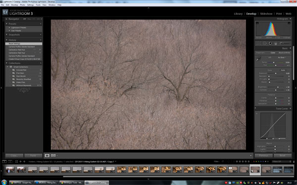
The color calibrated image is on the left while the Adobe Standard is on the right. Note the added sharpness and warmth that calibration brings to the left image.
I used to spend hours messing around with the sliders in Lightroom just trying to recreate the same vivid colors that I saw on my camera’s LCD monitor and all the while cursing Lightroom, Picasa, or Photoshop for gimping an otherwise perfect shot. Only last week did I discover the easy, automated method in Lightroom 3 to bring back the beauty camera’s in-house processing performs. This method is camera calibration. Simply follow these steps:
Open Lightroom 3 and select the photo you want to restore to your camera’s settings.
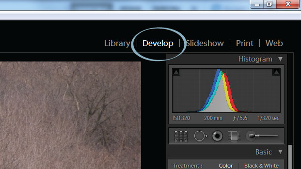 Click on the Develop
tab on the upper-right hand corner.
Click on the Develop
tab on the upper-right hand corner.
 Below the histogram at
the very bottom of the right toolbar is the Camera Calibration toolset
Below the histogram at
the very bottom of the right toolbar is the Camera Calibration toolset
The Camera Calibration allows for manual adjustment of the Red, Green, and Blue values of the image as well as the tinting of shadows. You will find something odd about this tool, namely: adjusting sliders in the Camera Calibration tool will not adjust the Hue/Saturation Sliders or Tone Curve of the image but rather defines a new “starting point” for post processing the image.
While the sliders can be used to make adjustments, the easiest method is to use the presets under the profile drop-down which for my camera (a Nikon d80) gives the options of :
The Adobe Standard which comes pre-selected for you also happens to be the blandest of all the profile options. I suggest trying one of the Camera Modes, one of which will most certainly closely match with the image your camera displays on it’s LCD monitor. My favorite is Color Mode 3 for it’s warmth and vividness when shooting nature shots, but it can be too warm and too vivid for portraiture or indoor shots and so this gives a good opportunity for overriding my camera settings to select Portrait or Camera Mode 1 on the rare occasions that I am shooting an event. The Vivid profile is also fairly interesting, but I would suggest using it on a case-by-case basis since it seems to blow-out already bright photos.
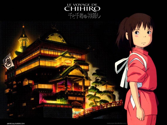
It was my luck that The Secret World of Arrietty came to Sioux Falls. This is my first Ghibli film that I could see in its proper setting: the big screen and I must say that it was a spectacular treat for the eyes, replete with stunning backgrounds and gracefully animated characters who play out yet another fantastical story. While Arrietty will probably not be my most favorite Studio Ghibli film, it does possess the wit, charm and magic that I expect from the creators of Spirited Away, Howl’s Moving Castle, and Princess Mononoke. It’s only real lack is in it’s pacing, which seems much slower than past fare and for some may be too slow.
I happened to watch Spirited Away the day after seeing Arrietty and it occurred to me how much sense of atmosphere Ghibli creates in their films through the deep sense of place and connection that chracters have with the environment that they occupy. Ghibli certainly pays very close attention to the details in it’s stories and illustrations and I think that this sense of environment is just one example of stroytelling that makes their films so tremendously delightful.
Environment in story informs the characters and plot, or at least it should if the author is paying any attention to their setting. A character who is actually living in their world will face the unique limitations that their environment creates – their culture, actions, and life will all be informed by this setting. Ghibli films realize this reality in a way that so many other films simply ignore. Their worlds draw upon the ambient emotions that nature’s many forms (violence, tempered, serene, and sublime) create in the human psyche. Let me take a quick glance at a few Ghibli films and illustrate how this plays out:
The atmosphere of Mononoke drips of the time when the wilds were an alien and unforgiving place for mankind. Early on in the film we see the difficulties that civilization has sought to overcome: the danger of predatory animals (Moro), the difficulty in navigating the wilds (the muddy and treacherous caravan trips), and deadly weather. Yet, nature still possesses a sense of serenity. The Emishii peoples seem to live a harmonious existence with nature as does San. The characters who find nature the most brutal are the ones who act the hardest to work contrary to their environment. Overall, the scenes create an atmosphere that mimics the internal difficulties of each scenes principal characters. For the caravaners the woods is a dangerous, frightful place but in the hands of Ashitaka the woods becomes a land of delightful and helpful spirits – the differences not in the woods, but in how the characters approaches dealing with their sense of place in the natural world.
Since Spirited Away takes place in a bath house and not the wilds we see a very different approach to place. The bath house of Yubaba is a fusion of Japanese and Chinese aesthetics that exaggerates the more gaudi elements of Chinese style and completely abandons Buddhist simplicity in everything but its depictions of the natural world. The bath house is simply an extension of Yubaba, who is a greedy and gluttonous crone. We see these characteristics not only in her employees but reflected back to them by Noh-face who absorbs the essence of the place as he stumbles about eating the staff and flinging gold about. Not until he disgorges the filth of the bath house can he go back to his simpleness.
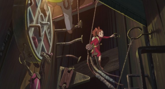
The world of the borrowers takes on a much more realistic charm that lies less in the fantastical elements as much as trying to showcase how the borrowers would interact with their gargantuan environment. Arrietty’s family lives in the walls of houses where they make their way about using ropes, nail staircases, and simple free-climbing techniques in an adventurous method that reminds me of real-world caving. They “borrow” from their environment as they take only what they need from the Beans who they both live beside and in fear of. I think in Arrietty we see a kind of modern Emishii where their lifestyle nurtures a kind of connectedness to their environment that emphasizes a sense of propriety over taking only what is needed while leaving the superficial (the gaudy playhouse) behind.
There was an article on Reddit this week encouraging folks to list this early photography blunders. A common one was the “cover every mm” mistakes – where you try to get zoom lens that cover the entire range of focal length possibilities. I know this mistake fairly well, I made it myself.
I started SLR photography in 2008 when, anticipating a Europe trip, I decided to dump my point-and-shoot camera for a Nikon D80. As with any important purchase, I researched the topic to death and often came upon Ken Rockwell’s site.
Here’s the thing. Ken Rockwell is a master of SEO. He will show up on pretty much any photo-related Google search. I think he has some excellent starting advice if you are interested in getting the best vacation and family photos out of your camera. However, I think that his reviews are rather subjective and lack the more thorough and systematic reviews that you would find on PhotoZone (a site, I sadly discovered after my camera purchase) and I do not think his is advice is geared towards someone pursuing photography as a fine art or career.
Being new to SLR photography, I fell into thinking I would need to cover the full range of focal lengths, and I didn’t care for carrying around the kit 18-55mm and 70-300mm lenses that were often sold with cameras. So I started looking at the 18-200mm lens, which today retails for $950. I assumed with such a hefty price-tag, this lens would be an upper tiered zoom lens and at the time folks (such as Rockwell) were raving about how it had replaced their need for all but exotic lenses.
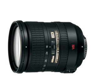
The truth is, the lens is soft, distorted and never took a shot better than my little point-and-shoot. As soon as I got home from my trip, I bought a prime normal lens and rarely ever put the 18-200mm on my camera again.
This learning experience was not all bad. I did get one thing out of the 18-200mm: I learned that I do not need to cover all the focal lengths. Indeed, I really only need three different prime lenses to cover my shooting needs.
You see, when I got back from Europe I looked through my photos and discovered an interesting pattern. I shot all my landscapes at 18-24mm, I shot everything indoors or medium-ranged at 50mm, and I shot all my telephoto shots at 200mm. Three distinct groups. I really did not need the ranges of 25-49mm and 51-199mm at all.
Today, I’m moving all of my lenses over to three lenses: Nikkor 35mm DX f/2.8 (or Nikkor 50mm f/1.4 when I get an FX body), Nikkor Micro 200mm f/4, and the Nikkor 12-24mm f/2.8. Three lenses at a much higher cost and covering a much smaller range of focal lengths, but worth it because they will take better shots than the 18-200mm ever did.
So my advice to new photographers? I would recommend that you buy prime lenses or if it must be zoom – keep the range of the zoom relatively small. As for the 18-200mm beast? It does serve a purpose. I would suggest renting it for a week. Take it on vacation or somewhere that you will likely make a lot of shots. When you get back graph out your most common focal lengths. A pattern will arise showing what you really need to cover.
Happy shooting.
When I started making websites in the 1990s we had a much smaller set of tools and a lot of websites were what we would today call “static.” A static site was nothing more than a folder of html files that contained both the content and layout of the site. If we wanted to change the layout of our site, we would either need to get new content or go through each individual file and update the layout.
Today we have CSS which introduced the paradigm of sperating content from layout. A site that applies this principle throughout its implementation will be a site that can easily be “reskined” or “re-templatized” without needing to port the content from the old site.
I have been working with CSS for some time, but one item about the WC3 standards always eluded me: the requirement for all HTML image tags to have an alt tag. Why should an image have an alt tag? Afterall, not every image has a suitable alt tag. Any given site contains drop shadows, gradients, invisible spacers, little meaningless image flourishes. Should we label each and every one? Then I realized why this rule is in place: the image tag must be reserved for content!


Lorem ipsum dolor sit amet, in cum possit oporteat, et vel aperiam apeirian. No
quem graece referrentur eum, ei his case gloriatur appellantur. Nec error
consetetur an, est dicam semper imperdiet ea. Eu duo choro recusabo. Qui at
velit aperiam, volumus sensibus deseruisse ei ius, mea an homero primis
scripta. Ex elit maiestatis signiferumque sea. Mei vidit efficiendi disputando
ex, ei erat soluta sed. Sit at nulla putent, ancillae honestatis eos an. Ius
nisl audire noluisse in, per ea commodo nominati, usu brute adversarium id.
Quem alia tamquam mel at. In atqui admodum vix.
There exists no real reason that the two curved images used to create the rounded corners on the above div should need an alt tag. Indeed, if we look at the source code, we would find this solution rather messy:
<span style="color: #009900;"><<a href="http://december.com/html/4/element/div.html"><span style="color: #000000; font-weight: bold;">div</span></a> <span style="color: #000066;">style</span><span style="color: #66cc66;">=</span><span style="color: #ff0000;">"width: 454px; margin: 0 auto;"</span>></span>
  <span style="color: #009900;"><<a href="http://december.com/html/4/element/img.html"><span style="color: #000000; font-weight: bold;">img</span></a> <span style="color: #000066;">style</span><span style="color: #66cc66;">=</span><span style="color: #ff0000;">"float: left;"</span> <span style="color: #000066;">src</span><span style="color: #66cc66;">=</span><span style="color: #ff0000;">"example_left.png"</span> <span style="color: #000066;">alt</span><span style="color: #66cc66;">=</span><span style="color: #ff0000;">"Example Upper Left Curve"</span> <span style="color: #66cc66;">/</span>></span>
  <span style="color: #009900;"><<a href="http://december.com/html/4/element/img.html"><span style="color: #000000; font-weight: bold;">img</span></a> <span style="color: #000066;">style</span><span style="color: #66cc66;">=</span><span style="color: #ff0000;">"float: right;"</span> <span style="color: #000066;">src</span><span style="color: #66cc66;">=</span><span style="color: #ff0000;">"example_right.png"</span> <span style="color: #000066;">alt</span><span style="color: #66cc66;">=</span><span style="color: #ff0000;">"Example Upper Right Curve"</span> <span style="color: #66cc66;">/</span>></span>
  <span style="color: #009900;"><<a href="http://december.com/html/4/element/div.html"><span style="color: #000000; font-weight: bold;">div</span></a> <span style="color: #000066;">style</span><span style="color: #66cc66;">=</span><span style="color: #ff0000;">"width: 340px; background: #dfe5e6; margin-left: 57px; height: 57px;"</span> ></span>
  <span style="color: #009900;"><<a href="http://december.com/html/4/element/div.html"><span style="color: #000000; font-weight: bold;">div</span></a> <span style="color: #000066;">style</span><span style="color: #66cc66;">=</span><span style="color: #ff0000;">"clear: both;"</span>><<span style="color: #66cc66;">/</span><a href="http://december.com/html/4/element/div.html"><span style="color: #000000; font-weight: bold;">div</span></a>></span>
<span style="color: #009900;"><<a href="http://december.com/html/4/element/div.html"><span style="color: #000000; font-weight: bold;">div</span></a> <span style="color: #000066;">style</span><span style="color: #66cc66;">=</span><span style="color: #ff0000;">"width: 434px; background: #dfe5e6; padding: 0px 10px 0px 10px;"</span>></span>Text Here<span style="color: #009900;"><<span style="color: #66cc66;">/</span><a href="http://december.com/html/4/element/div.html"><span style="color: #000000; font-weight: bold;">div</span></a>></span>
An image is content if it conveys a meaning or invokes an action. That is, if you can
Here is where CSS comes into play via the background property and where my earlier mistake takes place. I had assumed that the background property was expressed for the purpose of backgrounds! That is, since a div collapses if it contains no content, then the background property ought to be preserved only for divs that contain content in which case the background goes behind that content. My discovery is this: the background property is for *much more than just backgrounds!
It is best to think of the background tag as a means of adding stylized images or colored blocks into a design’s layout. So if we desired rounded corners on our divs we shouldn’t resort to using the image tag, but rather ought to use the background property on an empty div then add width and height to ensure it does not collapse such as so:
<span style="color: #009900;"><<a href="http://december.com/html/4/element/div.html"><span style="color: #000000; font-weight: bold;">div</span></a> <span style="color: #000066;">style</span><span style="color: #66cc66;">=</span><span style="color: #ff0000;">"width: 454px; margin: 0 auto;"</span>></span>
    <span style="color: #009900;"><<a href="http://december.com/html/4/element/div.html"><span style="color: #000000; font-weight: bold;">div</span></a> <span style="color: #000066;">style</span><span style="color: #66cc66;">=</span><span style="color: #ff0000;">"float: left; width: 57px; height: 57px; background: url('/images/posts/2012-02-21-properly-seperate-content-images-from-layout-using-css/example-ul.png');"</span>></span>
<span style="color: #009900;"><<span style="color: #66cc66;">/</span><a href="http://december.com/html/4/element/div.html"><span style="color: #000000; font-weight: bold;">div</span></a>></span>

<span style="color: #009900;"><<a href="http://december.com/html/4/element/div.html"><span style="color: #000000; font-weight: bold;">div</span></a> <span style="color: #000066;">style</span><span style="color: #66cc66;">=</span><span style="color: #ff0000;">"float: right; width: 57px; height: 57px; background: url('/images/posts/2012-02-21-properly-seperate-content-images-from-layout-using-css/example-ur.png');"</span>></span>
<span style="color: #009900;"><<span style="color: #66cc66;">/</span><a href="http://december.com/html/4/element/div.html"><span style="color: #000000; font-weight: bold;">div</span></a>></span>

<span style="color: #009900;"><<a href="http://december.com/html/4/element/div.html"><span style="color: #000000; font-weight: bold;">div</span></a> <span style="color: #000066;">style</span><span style="color: #66cc66;">=</span><span style="color: #ff0000;">"width: 340px; height: 57px; background: #dfe5e6; margin-left: 57px;"</span>></span>
<span style="color: #009900;"><<span style="color: #66cc66;">/</span><a href="http://december.com/html/4/element/div.html"><span style="color: #000000; font-weight: bold;">div</span></a>></span>

<span style="color: #009900;"><<a href="http://december.com/html/4/element/div.html"><span style="color: #000000; font-weight: bold;">div</span></a> <span style="color: #000066;">style</span><span style="color: #66cc66;">=</span><span style="color: #ff0000;">"clear: both;"</span>></span>
<span style="color: #009900;"><<span style="color: #66cc66;">/</span><a href="http://december.com/html/4/element/div.html"><span style="color: #000000; font-weight: bold;">div</span></a>></span>
or as we see in it’s final output:
Lorem ipsum dolor sit amet, in cum possit oporteat, et vel aperiam
apeirian. No quem graece referrentur eum, ei his case gloriatur appellantur.
Nec error consetetur an, est dicam semper imperdiet ea. Eu duo choro recusabo.
Qui at velit aperiam, volumus sensibus deseruisse ei ius, mea an homero primis
scripta. Ex elit maiestatis signiferumque sea.

Mei vidit efficiendi disputando ex, ei erat soluta sed. Sit at nulla putent,
ancillae honestatis eos an. Ius nisl audire noluisse in, per ea commodo
nominati, usu brute adversarium id. Quem alia tamquam mel at. In atqui admodum
vix.
A much cleaner solution to using alt tags! I hope this clears up some misconceptions about how to properly use the image tag and how to utilize CSS for layout images.
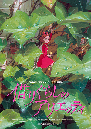
I saw the trailer to The Secret World of Arrietty when I went out to watch The Muppets back in November. Now mind you, I was out on Thanksgiving break visiting my folks in the frigid north of Escanaba, Michigan. The Northern Midwest is not know for its taste in eclectic films – theaters up there typically run the top selling Hollywood flicks of the week and little more. So you can imagine my delight to see a Studio Ghibli film being advertised in such a mainstream venue!
It seems that this is a new move for Disney, which according to The Ghibli Blog, will be promoting the film with a release in 1,200 theaters this month. Unfortunately, from what I can find: there is no release scheduled for Sioux Falls. So I’m either going to have to drive or wait for the DVD release.
On a lark, I went out to WestMall7 and choose to watch whatever film happened to be airing. Now, WestMall7 is Sioux Fall’s second-run theater. Its good for its cheap popcorn and cheaper tickets. Although, much of the popcorn seems to end up on the floor in this place and The seat cushions, I believe, are from the 1980s – the springs long worn out.
I have been avoiding WestMall7 for the last couple of months on account of there being no good films out. The Christmas flicks have yet to hit the screen and the flicks that aired between the summer blockbusters and the holidays are a rather large collection of duds. I settled on The Darkest Hour as what seemed the least worst film.
The Darkest Hour is about a group of early twenty-some-things trying to escape Moscow after an attack by an alien force. The film follows the fairly routine alien invasion that we have come to expect from the offspring of The War of the Worlds. Although, unlike Independence Day which attempted to modernize War of the Worlds with a computer virus rather than biological virus – The Darkest Hour falls into a distinct escape from the invisible monster scenario.
I expected this film to be one of the laughably bad kinds. The marketing department that designed this film must have thought that the audience wants to bond with Mark Zuckerberg impersonators and the bubbly-headed American tourist girls who seem terrified to be outside of their home country.
Empty characterization aside, some of the ideas in The Darkest Hour are rather interesting and if the writers explored these ideas in a more unique manner (rather than hacking together a cookie cutter sci-fi flick) we would be walking away with a much different impression of the title.
For example, the aliens of The Darkest Hour are energy-based life forms. This idea has been explored in written and televised works, but never in this much depth. The characters face a difficult challenge in defeating and understanding an opponent that is essentially invisible and detectable only through the destruction is creates and side-effects that it has on electrical equipment.
Nevertheless, these ideas are never really explored. The protagonist explains them away in narration – why they want to attack earth is never explored, but just given to the audience, much like the characters are given each of their solutions to the alien threat. Midway through the film, after just days from the initial alien attack, mad scientists suddenly appear seemingly anticipating the attack and armed with portable electron guns and protective faraday cage hideouts. Militias appear who seems to have a deep understanding of their invisible opponents and have developed technologies and tactics to defeat these invaders that belay more skill and artifice than could be learnt in a weekend.
Hence the largest issue in The Darkest Hour: pacing. The protagonists shelter during the early invasion in a cellar and emerge a week later. In that time, it seems they have been transported twenty years into the future.
Other issues abound. The protagonist discovers that the aliens are blinded by glass. Yet the writers ignore this fact when the aliens, from the street, spot the characters rummaging inside an apartment building hundreds of feet away. Likewise spatial logic is redundant as one character falls off a boat and ends up transported miles away across the city. Are we to suppose that upon reaching shore she decided to walk away flee from her companions rather than attempt to meet up with them at their destination some hundred yards down river?
I am glad that it was a mere three dollars to see The Darkest Hour and I should hope that in the future such ill thought works can be kept to the SyFy channel.
I spent two goods nights last month working through a series of photographs that I intended for Christmas gifts. Perhaps one of the most challenging post-production works was this photograph I took of a hive in Gallatin National Forest just south of Livingston, MT.

This shot is actually a composite of two different shots. You see, I took nearly a dozen photographs of this hive free-hand during sunset. There was little light and in only a small handful of shots was the hive sharp. The composition for the piece was also a challenge. A number of shots have twigs in distracting locations drawing the eye into the background. Yet, if the hive is centered, it becomes to dominate. The hive had to sit at a roughly 1/3rd mark to really bring out the shot, but this only occurred perfectly in one shot which was not sharp. The solution? I combined two different shots. One, for the composition and background and a second for the subject matter. The image below shows the two originals side by side. The left shot I used for the composition, but I edited the hive from the right shot on top of the left shot.

I used Photoshop to get this effect. First, I opened both images in the raw editor and worked the settings until they had matching histographs. I overlayed the new image on top of the final background composition and masked out the parts of the image that I did not want to use until I had a layer that looks like the shot below:

When I zoom to 100% you can easily see the benefits of combining the two shots. Note how the final work on the left is crisp, while the old hive on the right is blurred:


It’s about time that winter got to these parts. This last week saw about 6” of snowfall over the weekend and a couple extra inches through the week.

I recently attended a showing of The Iron Lady at the bequest of my girlfriend. I was initially reluctant to see such a production – not because of some distaste for a biopic of Margaret Thatcher, but because I feared that it would just be a simple film riding on the coattails of last year’s The King’s Speech.
The King’s Speech won four Oscars last year and for a very good reason. It is an eloquently produced work illustrating the changing political climate of Britain as it transitioned from the Victorian into modern times. Yet, here we are one year latter with yet another film about yet another British ruler. How can I not consider this a grab on the prior work’s success?
Nevertheless, I was surprised to find that The Iron Lady can stand upon it’s own accord. I knew little of Margaret Thatcher going into the film, save that she was an influential Conservative party politician in Brittan through the seventies and prime minister through the eighties. Folks still talked and argued about her influence when I went to Oxford just a few year’s back. She seems to be a rather reviled women and yet surprisingly influential on British society.
The Iron Lady showcases a kind of highlight reel of Thatcher’s life. A few scenes from before her entrance into politics, her campaign for leadership of her party, a handful of NRA inspired terrorist attacks, the Falkland’s war, and her eventually fall from authority. Overall these scenes are rather touching and masterfully performed by Meryl Streep.
Yet, he film spends it’s time predominately dealing with her current dementia. This is surprising since there is such a wealth of material from her actual life as the first female Prime Minister of Brittan and this dementia deals so very much with her late husband who is scarcely found in her historical remembrances.
My initial response to the film was delight. As a biopic, I walked away rather inspired to hop online and research more about Thatcher. As the days pass however, I find myself more and more caught up in the film’s narrative failures in a way that I did not feel with The King’s Speech. Indeed, whereas I might go back in a few years time and enjoy The King’s Speech again – I do not think I shall do so with the The Iron Lady.
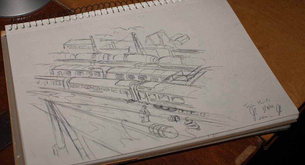
My first sketch this week was an attempt at a train locomotive. This sketch did not turn out very well. I erased it, and started over with a more general sketch of a train yard that I found.
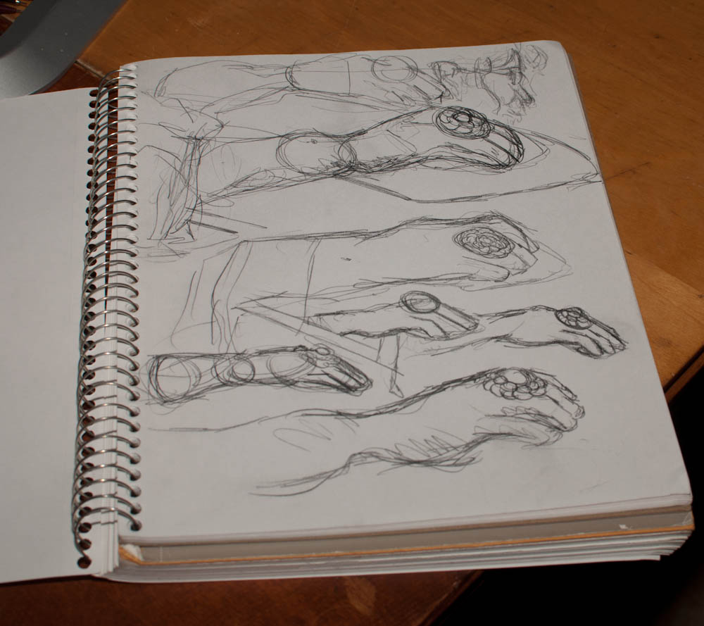
A second sketch was done while my girlfriend worked on the computer. Sitting across from her, I sketched her hand over the mouse. Both of these sketches I did with a 0.5mm drafting pencil with standard softness lead (around HB). This is softer than I am typically used to working with, but I find that the lines are more expressive when sketching quickly and I enjoy the effect when not working on a more precise drawing.
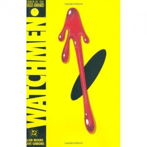
I wrote a short review about Watchmen back when the film came out in theaters and while I have read the book, I wish to address the film in particular. I will be revealing a lot of the plot devices in this one, so if you haven’t had the chance to read or watch the film, I say skip this and come back once you have.
Watchmen is to Super Hero films what Neitzche is to Nihilism. It would seem at first that Watchmen is just a grittier version of the Super Hero genre. Filled with anti-heroes, sex, violence and the dynamics of less-than-perfect humanity, the work portrays itself as being a critique of Super Hero romanticism.This may be true in the graphic novel, yet the film takes this concept slightly further in its alterations to the ending.
Through the earlier sections of the film we are introduced to a post-Neitzchian society. The ambitions of man are kept in checked by a careful balance of political power. Russia and the USA have the bomb, but the USA has Dr. Manhattan – a superman with the power to see through time, cause people to explode, and any number of other powers. This superman is Neitzche’s ubermensch. Yet, his mastery is bent to the futile intrigues of his surroundings and he has become disconnected with mankind and he begins to see past man and into their empty, futile attempts to placate fate. The greater part of society is now living post-god in which man exists not in fear of some retributive all-powerful deity, but must only fear the retribution of his fellow man. Such fear was kept in check for a while by the threat of the vigilante”Watchmen,” who superseded the law authority to enact retributive justice upon lawbreakers.
Here is that central theme of Watchmen: is there any justice at all? Certainly it seems in the text that the justice of the political fails to address the people’s needs to see justice served. Society is rank with villainies such as robberies, murders, rapes, and muggings. The Watchmen, more or less, are also not the answer to justice as each of them pursues their own particular view of justice which in the end is merely self-serving. Heroes such as Silk Spectre or the Comedian are merely in it for the fame and power and Nite Owl is fueled by a sense of wishy-washy moralism that exists more out of expediency than the virtuous determination we see among Super Heroes. We see fellows trying to rise up to the status of Nietzsche superman. They establish these self-made virtues but cannot follow through with them, and so fall back into the line of the society of men. Watchmen’s society is thus that of a nihilism, not Nietzsche’s self-determinant society of supermen and the answer in Watchmen is not that of the existentialist, but of the necessity of re-establishing God in order to keep man in line.
Look at the film’s end. Viedt’s mastermind plot is to subvert nuclear war by attacking first. He nukes all of the super power’s city centers using weapons designed to look like Dr. Manhattan’s unique radioactive signature. These attacks force society to re-evaluate itself and come together in the realization that they have much larger threat to mankind: Dr. Manhattan. Dr. Manhattan is thus God incarnate, a new kind of messiah who saves not through sacrificing himself, but by sacrificing the rest of the world. This is the vengeful God of the old testament who will suffer none of the squabbles of humanity. By providing the world with this new-found maker of miracles (or ought I say plagues), Viedt reveals that God is very much alive and he is a giant blue man.
Dr. Manhattan, fed up with meaningless bickering of mankind, leaves earth for the sterility of the heavens where Viedt can assure the people of earth he is watching over them carefully. Again that father-figure is restored into culture and the nihilist society is resolved not by truth but by the re-establishment of a great lie.
Rorschach, however, is our true super hero. The man who is fighting for truth and very much believes in justice. Viedt, and ultimately Nite Owl believe in alleviating suffering not the upholding of an abstraction like justice. In the world of the Watchmen there is no place for a man who truly believes that there is justice. Such a man would be absurd or “nuts” as Rorschach is referred to by his fellow super heroes. Yet if we superimposed Batman, Superman, Spiderman or any other superhero into this space they to would be seen as hopelessly naive at first, and if the hopelessness of society didn’t drive them to the madness of Rorschach then they would be rather unbelievable. No, Rorschach is representative of a desire for a just world. He wants a world that is more than just nice, where people are pleasant and freed from suffering. He wants a world were justice is seen to and the people virtuous. Such a man cannot live long in the mockery that Viedt creates: the world of lies that we live in as we tell ourselves that all is right and just in the world. In the end, Rorschach is killed by Dr. Manhattan because there is no place for a just man in such a world.
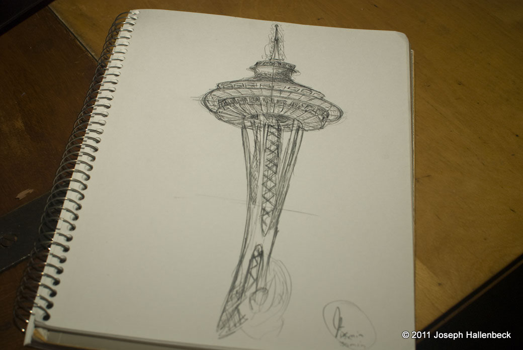
This week’s pick from my random sketching – an attempt at sketching Seattle’s famous Space Needle.
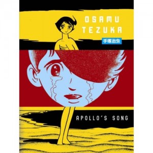
I recently procured a copy of Apollo’s Song which, like many of Tezuka’s works, is printed in a thick 500+ page single volume. The first English run was in 2007, and currently is out-of-print according to Amazon. Nevertheless, Vertical has a good reputation for keeping its library in print and has republished the text in a two-volume series.
Apollo follows the lives of Shogo, a young boy whose admitted to a psychiatric hospital for his atrocious abuse of animals. Due to an abusive upbringing by a prostitute, Shogo is unable to love and finds the pairing of even animal mates repulsive. During his first treatment of shock therapy, Shogo experiences a vision in which he is visited by Athena, the greek Goddess of wisdom. She foretells to Shogo that because of his transgressions against love he will be denied the sanctity of love – in every life that he finds a women to love, the two of them will be divided and perish shortly thereafter. The remainder of the text follows Shogo through each of these lives lived: WWII, a present-day Eden, the present “real” world, and the future. In each of these lives Athena’s fate follows him in an endless tragedy.
We must keep in mind the time period in which Tezuka is writing: the 1970s which at least some sources hint at being fairly conservative towards educating Japanese children about sexuality and is following up on his, perhaps more artistically complex Ode to Kirihito. For coming so late in Tezuka’s career, I am suprised by Apollo. The art is very much a throwback to his earlier works. Characters, on Scout McCloud’s big triangle, are quite a bit further away from resemblance – they are far more abstracted and morphic. This can, at times, distract from the seriousness of Apollo’s pathos. Perhap’s Tezuka’s throwback to his earlier days is because Apollo is a much more positive encounter with Tezuka than his medical dramas, which often focus on the brutality and selfishness inherit in the human character. If we were to find ourselves living in the world of Kirihito alone we would find it a brutal, uncaring existence filled with selfishness and cruelty and very much lacking the friendship and love that Tezuka attempts to address in Apollo.
The nature of manga publication in the United States is that it is a youth-dominated market and the youth want what’s hot and new in Japan today. This leaves those of us who are more interested in manga from a cultural perspective in the dust as, short of learning Japanese (or French), we have little access to some of the older volumes such as the works of Tezuka, Tatsumi, or Matsumoto. For this reason, I must continue to sing endless praise for the fine work of the editors over at Vertical, Inc. who have been faithfully translating the ovouer of our good Tezuka.

The Japanese “hot pot” is a very healthy and romantic meal to share through the winter months. These dishes are heavy on the leafy greens, mushrooms, tubers, tofu, fish, and mussels and low on the creams and fats of western fair. However, their signature is the savory broth of dashi, soy sauce, mirin, and sake. The recipe this time:
In a large cooking pot prepare the sauce the night prior and let sit overnight. Remove the kombu strip from the broth and set the pot on a burner at medium-high heat. Cut vegetables into bit-sized pieces and add the tofu and bok choy leaves to the broth then bring to a boil covered. After five minutes add the assorted mushrooms, cover, and bring to a boil again for another five minutes. Lastly, add the spinach leaves and spices, remove from heat and cover. To give the spinach time to steam, let stand for five minutes. Enjoy!
Last month I composed a short essay detailing what I consider the “Exploration” game or “Zen Garden” game. When I composed that essay, I had a few titles in mind that I considered the seminal titles of this genre.
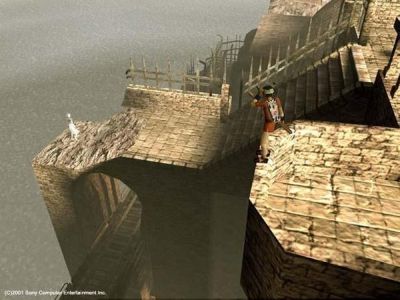
Ico came out for the Playstation2 in 2001 and it, and along with Shadow of the Colssus has recently been re-released with a graphics upgrade for the Playstation3. Ico is ultimately an adventure-puzzle game with a light mixture of combat elements. The game is played from the perspective of Ico, a horned boy who is imprisoned in a gargantuan tower. After freeing himself from his immediate cell, he meets Yorda, a magic girl who unlocks the massive stone doorways that block Ico’s escape from his jail.
The game play focuses on the difficulties of navigating the collapsing tower. Ico can climb, jump, and fight. Yorda can open the doors, but otherwise must be led by the hand through each level, and helped up walls. On top of that, if she is abandoned for too long shadows creep up from the ground and try to make off with her.
Since the puzzles themselves focus to heavily upon the environment of the game, the tower is very lushly illustrated with hanging ropes, rotting wooden buttresses, and bridges that stretch over blue watery coast. The player must spend his time examining the space, moving through it, and puzzling over how the space can be surmounted.
This brilliant title by the same studio responsible for Ico is oft cited as an excellent example of how video games could be elevated to an refined art form.
Shadow of the Colossus takes the adventure game and simplifies it down to one aspect: boss battles. The game plays through sixteen battles with the hulking colossus – gargantuan roaming creatures who each present a unique and puzzling challenge to overcome. Yet, to reach each of the colossus the protagonist must first journey on horseback through an empty, expansive wilderness. The land is covered in toppled ruins, lush forests, and flowing steams. The colossus themselves are often gentle creatures and their deaths are pathos laden affairs that hint at a less than virtuous conquest.
Like Ico, SotC is a puzzle game merged with the real-time over-the-shoulder elements of the action-adventure genre. It’s elevated into the realm of exploration by both its lavish detail to the landscape and it’s atmospheric emphasis.
I must sadly admit, I never completed Link to the Past and so I must put forth Link’s Awakening as the best of the Legend of Zelda 2D iterations. The Link to the Past is the definitive exploration game. The world begins first with Link awakening on a small island where he is confined to a small space by the necessity of finding the tools (sword, bow, shield, &c) that will open up more of the island. The game is riddled with little mini-games, sidequests, and clever level design that fits together like a massive puzzle.
Like Link to the Past and the original Zelda, Link’s Awakening plays from an isometric perspective. Link runs about in real-time, and unlike the traditional J-RPG, combat takes place in the over world through sword swings, arrows, and shield blocks. The other item that makes Link’s Awakening stand out over the J-RPG is the attention to detail. The realm is very lush, precisely arranged with deep care. The action-adventure game play removes the elements of grinding that have come to dominate the RPG genre.
I saw Okami in 2004 at E3 and it was easily the best title on the show floor. Okami builds on the action-adventure elements of Ocarina of Time – 3D adventure title with real-time combat, item collection, clever dungeon puzzles, big boss battles, and an amusing combat system. Then it adds some new spices to the mix such as a creative Ukiyo-e look, J-RPG styled combat zones, and a healthy heaping of traditional Japanese myth. This creates a game that in every way embodies the idea of world exploration found in the Zelda series but also sets it apart with a much more mature tone and unique setting that defines Okami as a distinctive story-space from Zelda. It isn’t just aping it’s predecessor’s gameplay, it is attempting to refine it into new form.