December 23, 2011
Sketch Journal #8 - Merry Christmas!
For Christmas this year I sketched Calvin & Hobbes themed gift tags using Calvin’s many snowmen as an inspiration.
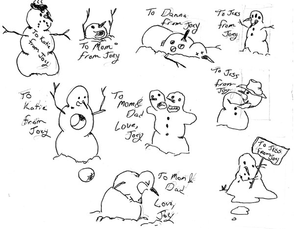
For Christmas this year I sketched Calvin & Hobbes themed gift tags using Calvin’s many snowmen as an inspiration.
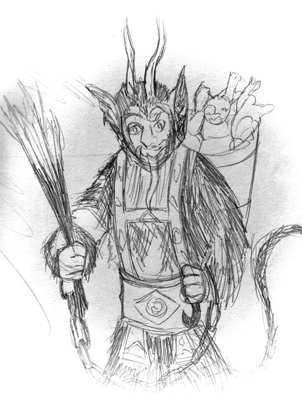
I discovered the Daily Sketch Reddit this week and have added thirty minutes of sketching off their prompts to my daily routine. One of the nicer sketches this week was that of Krampus the mythical christmas demon of central Europe.
I started to dig through the noitaminA block of Anime from the last few quarters to see if anything got a good review on ANN. I find that anything from noitaminA and gets a large volume of tens has a tendency to live up to my expectations. What I stumbled upon was Ano Hi Mita Hana no Namae o Bokutachi wa Mada Shiranai or We Still Don’t Know the Name of the Flower We Saw That Day. I am perplexed by the length of this title. I find Japanese titles often end up being oddly long before domestic translators get a hold of them and chop them down to size. I don’t even think we could turn this into a acronym AHMHNBMS?). I’ll call it Ano Hana for now. Below consists of my initial impressions of the first episode.
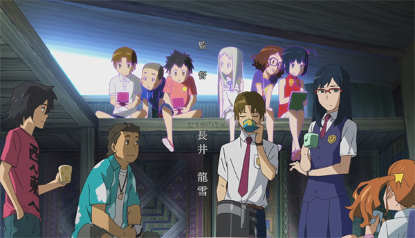
The production value of Ano Hana is, akin to most noitaminA productions: very high. The backgrounds are rich and complex with a healthy mixture of colors. The character designs are varied and animations rather well done. That said, my initial impression is to be unimpressed with Ano Hana.
We get a fairly good outline of Ano Hana’s plot in the first episode. Menma died in a childhood accident, her ghost returns to Jinta to ask for a wish to be granted. The young ghost forgets the wish and instead tries to get the, now older, Jinta back together with his childhood friends. Jinta, a shut-in, has little interest in going out to socialize with his old friends who have drifted apart becoming shallow and vain teenagers. This plot seems far too ripe with pathos for the age of the cast. The flashbacks to their childhood, which is really just a few year’s prior, held little power when I realized that the characters still had a long, productive life ahead of them. At least Ebenezer Scrooge was visited after a long, unproductive life when we can actually feel sad for his having wasted it. Such makes the meager few years that Jinta and company spend saddened by Menma’s demise paltry in comparison.
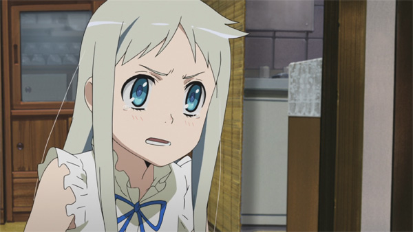
A large part of my dislike surrounds the character of Menma – a frail looking stick of a girl who is definitely of the
Moe character type. Her design is reminiscent of K-On! or Sora no Woto and showcases a similar characterization to K-On!’s female cast. A full analysis of why I do not particularly care for Moe would require more space than I wish to go into right now. In simplest terms: I feel that reliance upon such pre-built characters tends to generate a very shallow story, one that I have seen before and have no interest in going through over and over again. Anaru, Yukiatsu, and Tsuruko also seem like rather shallow characters, the caste is only saved by my interest in the character of Poppo who appears at the very end of the episode. Suddenly, I have a character who I might be able to relate to and find interesting enough to continue through the entire series.
I started working through my library of photographs lately in order to sort out (through hundreds) the chaff from the wheat and begin trying my hands at post-production. I typically stick with a rather traditional methodology. I make adjustments to the raw file, but stick away from more elaborate composition effects.

Model: Nikon D80
Shutter: 1/10 sec
Exposure Program: Automatic
F-Stop: f/5.7
ISO: 100
Focal Length: 170mm
Lighting: None
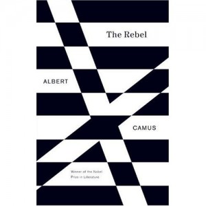
After several months of video game reviews, let’s take a look at something entirely different, a text that is a rather appropriate capstone to the events of 2011: Albert Camus’s The Rebel.
In The Rebel, Camus examines the history of the revolutions in Europe – starting with the French Revolution in the late 18th century which deposes the Divine Right of Kings, forever altering the role of religion in the state and ultimately the faith of the cultural revolutions of the dandy’s rebellion against Victorian society, the Marxist/Russian revolutions of the 19th century and the culmination of these revolutions with the nihilism expressed in Nazi Germany.
Through this examination of history, Camus examines the ethics of the rebel. He establishes the causes of rebellion, why rebellion ultimately becomes violent anarchy, and illuminates the reasons that we will most likely not see a return of these rebellions in western society.
In reviewing the international news events of the last year, we can definitely see this: uprisings in the Egpyt spreading over toLibya. Rioting over austerity in Greece and Brittan calumniating in the OWS encampments in the United Statesover similar issues. Yet, in the west the response has been much more tempered than the violence in Libya. As Camus points out, the rioters in the West, while displeased with the failure of the state are also very much interdependent on the success of the state. They cannot simply tear down the market system without tearing themselves down as they forfeit their livelihoods and retirement benefits.
In light of these events, it is a good idea to sit down and examine the successes and failures of past rebellions. Hence, Camus’ 1951 text is a very timely, timeless text to pursue. Camus recognizes that a successful revolution requires temperance by the rebel – a willingness to recognize that the state has wronged them, but to not fall to criminality in response to the state. When the rebel revokes limits and is willing to engage in the self-same murder that he accuses the state, then he also revokes his own legitimacy. The limitless rebel creates the various revolutionary disasters that we see inRussiaduring Camus time, and in more contemporary times,Central America.
The Rebel is also an easier read than his earlier work, The Myth of Sisyphus. The later work requires a much more complete understanding of Existentialist philosophy (namely, Kierkegaard, Sartre, Nietzsche). Whereas, The Rebel relies upon a much more common historic background that less philosophically inclined readers are more likely to possess or could easily be researched through a brief glimpse at Wikipedia’s entries on the French and Russian Revolutions. A general understanding of Hegel’s concepts of history and it’s importance to 19th century ideologies as well as a general overview of Nietzche’s master/slave dialectic can help with the reading, but are not necessary.
Last week’s reflections on Okamiden upon the game’s qualities resurfaced an old musing regarding games. I am very particular about the games that engross me through thirty or sixty hours. Most games, by some aspect of their design, fail to illicit such a strong emotional response. What are the qualities of these games? What aspect of the design of say Super Mario 64 illicits such a strong response whereas Rachet & Clank brings out little to no response.
The feeling of playing Okamiden is different from playing Call of Duty. I am an avid World at War player and can easily sink a hundred hours of multiplayer game play over the course of a year. Yet, there is no resonance with Call of Duty. There is frustration, truimph, and overall competition. I play such games to build up a skill set and use it to triumph over other players. Nevertheless, victory is fleeting. Like any sport, the match is reset, I play again. Each round is unique with different opponents, different permutations of strategy. It is fun to play such games, but they are not fulfilling. The need to play is endless because each round brings on the next in an endless series that never draws up into some telos.
Massive Multiplayer Roleplaying Games (MMORPGs) come in the same spirit as the first person shooter, abet without the sense of competition. In the MMORPG, the player begins the game and progresses up a ladder of levels, exploring new spaces and expanding a repertoire. In this genre (World of Warcraft, Eve:Online, Graal), I never got into the ‘end-game.’ The repetitiveness of the game-worlds eventually drove me away, but not before I could explore the space where these games take place. These titles are better, but still do not capture the sensation I find in Okamiden.
The obvious answer is that Okamiden is a single player title, whereas Call of Duty and World of Warcraft are multiplayer title. This is a correct observation, I only bring up these multiplayer titles as examples of other titles I actively play and to say that while they engross my attention they never leave me wistfully recalling my experiences with the game.
What is different?
This question, I think is much larger than I first thought. Indeed, in answering I think we ought to dispense first with the rather clumsy system of genres that journalists and developers have hobbled together over the years. First-person shooter, adventure game. platformer, puzzle game. These categories define aspects of game rules whereas I am thinking about something much more ambiguous since this element is found in both the earliest Mario platformer to the puzzles of Ico and combat orientated of Muramasa. Certainly, it would not hurt to transgress the history of games to see where first this element arises.
In the late seventies with the games like Adventure and more importantlyZorkappear on the scene,. I wish to address Zork since this title I do have experience with. Zork is an interactive narrative. That is it. You read the paragraphs of text, pick out nouns such as “mailbox,” or “rock” and then experiment with simple verbs such as “open,” “pick up,” or “throw.” The game world exists on a sheet of scrape graphic paper or only in the player’s mind if they have a memory for it. The text-based adventure game eventually becomes the graphical adventure game with titles like Myst where the player clicks about the screen. The gameplay of Myst is altogther like that of Zork, but what once was a text parser is now represented through icons.
How are these titles related to Okami and Zelda? They rely upon a narrative to drive the game foreward. Gameplay exists as logical puzzles rather than hand-eye-reflex coordination. Zelda is sometimes catalogued as an Action Adventure title for this very reason. Nevertheless, so is Tomb Raider, Grand Theft Auto, and God of War. Zelda shares very little in similarity to these latter titles, indeed there is more ressonance between Zelda and Zork then Zelda and GTA. Action Adventure is not a good definition for Zelda because so often it is Action that is emphasized over Adventure in Action Adventure titles.
The early Adventure games focused upon narrative since their entire world must be expressed to the player through description and exposition. Zelda, like Zork focuses on description and exposition particularly relating to the exploration the space game takes place in. God of War, GTA, however, focus on the action and in particular the actions of the protagonist. Moreover, there is a larger aspect to the spatial arrangement of titles like Okami and Zelda. Namely, that they present themselves as a kind of Zen Garden.
I need to find a copy of Andre Vestal’s The History Of Zelda or David Shaff’s Game Over. The first, a gamespot article, seems to have disappeared and the latter unavailable to me from the local library. I will have to resort then, to wikipedia:
“The Legend of Zelda was principally inspired by Shigeru Miyamoto’s explorations as a young boy in the hillsides surrounding his childhood home in Sonobe, Japan where he ventured into forests with secluded lakes, caves, and rural villages. According to Miyamoto, one of his most memorable experiences was the discovery of a cave entrance in the middle of the woods. After some hesitation, he apprehensively entered the cave, and explored its depths with the aid of a lantern. Miyamoto has referred to the creation of the Zelda games as an attempt to bring to life a “miniature garden” for players to play with in each game of the series.” (Wikipedia)
The Legend of Zelda is precisely this, a recreation of the natural world or a “pocket garden” as other Miyamoto interviews put it. This garden aspect makes the childhood encounter with nature a centrifugal aspect of the gameplay. The arrangement of the levels intended to create the miniature abstraction of landscapes found in the zen rock garden. The closer then that a level design adheres to this idea the greater the calming and exploratory aspect the game takes on. Thus we see this aesthetic in the Japanese titles of Okami, Zelda, Mario, Ico, and Shadows of Colossus. We see this less often in the western designs, but rather get God of War and GTA – action driven versus reflective-driven titles. Nevertheless, western developers do approximate this effect in titles like Elder Scrolls, Myst, or Banjo & Kazooie (in fact, I could argue that no platforming title can have good level design without some stumbling upon these principles).
I would call this category the Zen Garden or Exploration Game and I see these titles as the aesthetic pinnacle of game design.
I suppose it’s not really news that the 2011 Christmas season for game releases is somewhat excellent this year around. Studios always seem to hold out on their big-budget titles until around this time of the year, so let’s examine my top five picks for this year:
I played Elder Scrolls Oblivion back when it first came out. The graphics Skyrim’s predecessor blew me away and I spend countless hours wandering about the countryside in search of herbs. Unfortunately, collecting herbs and perfecting non-combat skills in Oblivion just got you killed as your opponents would all level up to match you’re supposed new combat prowess. Later mods for the game would resolve a lot of the launch issues, transforming it into a much more enjoyable experience. For this reason, I’m sticking away from Skyrim until the mod community has had a swing at it. That said, the graphics and in-game footage that I have seen so far blows me away.
I have yet to pick up a 3DS, and I most likely will not be picking one up anytime soon on account of the plethora of unopened DS titles on my shelf. Handhelds have always been in my sweet spot for games, and a lot of experimental titles seem to hit handhelds – and thus by wallet. If I had a 3DS, I would most likely be picking up Super Mario Land 3D. The previews that I have seen so far make the game out to be the successor of Super Mario 64. Anything that gets us more of the traditional Mario experience and away from Miyamoto’s more experimentive (Mario Sunshine?) titles would be good in my book.
Maybe I ought to get a 3DS, there seems to be a lot of items on my list that are coming out for it. I’ve played the Mario Kart series all the way back to the SNES and I have found every iteration of the formula to be refreshing and extremely fun.
You should’ve seen this one coming. I am extremely excited about Skyward Sword. Accounts from friends say that it is reminiscent of Ocarina of Time and with a story of equal measure. In particular, I am excited for the first Zelda title that was designed for the Wii hardware.
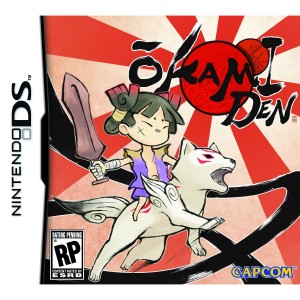
A quick post to point out that there is a new article, examining my early impressions of Okamiden, over at The Wind-Up Culture Blog. I actually have new material lined up for the next few weeks on the blog, and I plan on making it a point to update the site at least once a week with new material throughout the winter.
Drifting in the Sea is still on hiatus. I am not sure if I want to continue the current plotline, or devote what little time I have into working my comic adaptation of the Saga of the Volsungs, and complete the series of Weird short stories that I began last year on my road trip across the southwest.
In other news, many of my first sites at Gage E-Services will start to roll out over the next few weeks. I have a lot of work done adding modules, and fixing items on existing client sites – but these will be projects that I worked on from the early design stages up through completion. I am very excited about this.
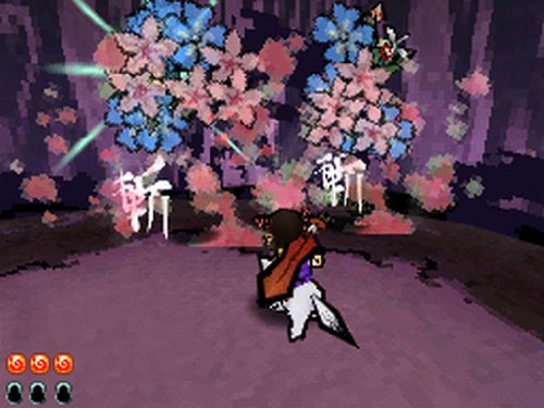
I am six hours into Okamiden right now or roughly a quarter of the way through the game. Considering Okami is one of my favorite games for the PS2, Okamiden as a sequel has some very big shoes to fill. My initial impression of the game was just how similar Okamiden is to it’s big brother. It replicates many of the game environments from its predecessor, the brush-manipulating game-play techniques, and graphical styles. Yet, it does this in a very paired down system and it can be difficult to judge Okamiden harshly because it’s landscapes are more restrictive, combat less frantic, or content less grandiose.
After a few hours, the comparisons drift aside and I can enjoy Okamiden for what it is – a very fun adventure title that captures all of the witty plots, beautiful scenery, clever puzzles, and elaborate art of it’s predecessor. I am even glad to see such a faithful recreation of Okami’s setting since returning to Shinshu fields and Kamiki village brings back a very fond memories of the other games. I get a great deal of delight in reconnecting with the characters of Mr. Orange, Susano and Issun – much like meeting friends whom you haven’t seen for a long while over for lunch. In many ways, this gives_ Okamiden_ the feel of an after-story, or a kind of prologue to the events of Okami in which the protagonist revisits the places where he has been in a kind of mini-adventure, such as when Frodo returns to Hobbiton in The Lord of the Rings.
The plot generally follows that of Okami: great evil sweeps over the land, demons abound and the wolf-god Chibiterasu, the descendent of Akamatsu (Okami’s protagonist) must go about the world cleansing it of the presence of demons and restoring the land to health so that the cherry blossoms and bloom again. The strength of the plot is that it keeps pulling you back to old characters and developing them throughout the game rather than pushing the protagonist out into a world of generic cardboard characters and endless scenery changes. I expect to return to the village of Kamiki and Yakushi time and again throughout the game as I chase over old hunting grounds on new quests. This sense of place found in the Okami series captures the spirit of Ocarina of Time better than any of the Zelda titles that attempt to homage that N64 title.
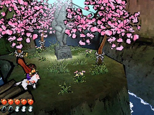
The aesthetic experience of Okamiden recalls the Edo-period wood-block prints of Japan with tapered outlines and a very warm solid palette of colors. However, recreating the style of Okami on the DS’s limited hardware causes some issues. Frame-rates for character animations seem rather low giving Chibiterasu a bit of a jumpy walk and causing combat to be disorientating. The maps are also cut into very limited spaces requiring load times when stepping from one space to the next and interactive objects only loading into view once Chibi is nearly standing upon them. Okamiden could have taken a note from the old Super Mario 64 title which has much more seamless loading transitions.
Despite these fallbacks, I would say that Okamiden is beating out all of the DS Zelda titles for the crown of “best” DS Adventure game. I am looking forward to playing through it to the end and getting back with a final report.
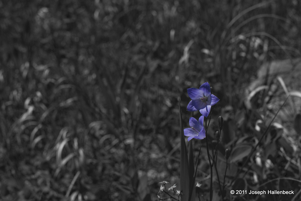
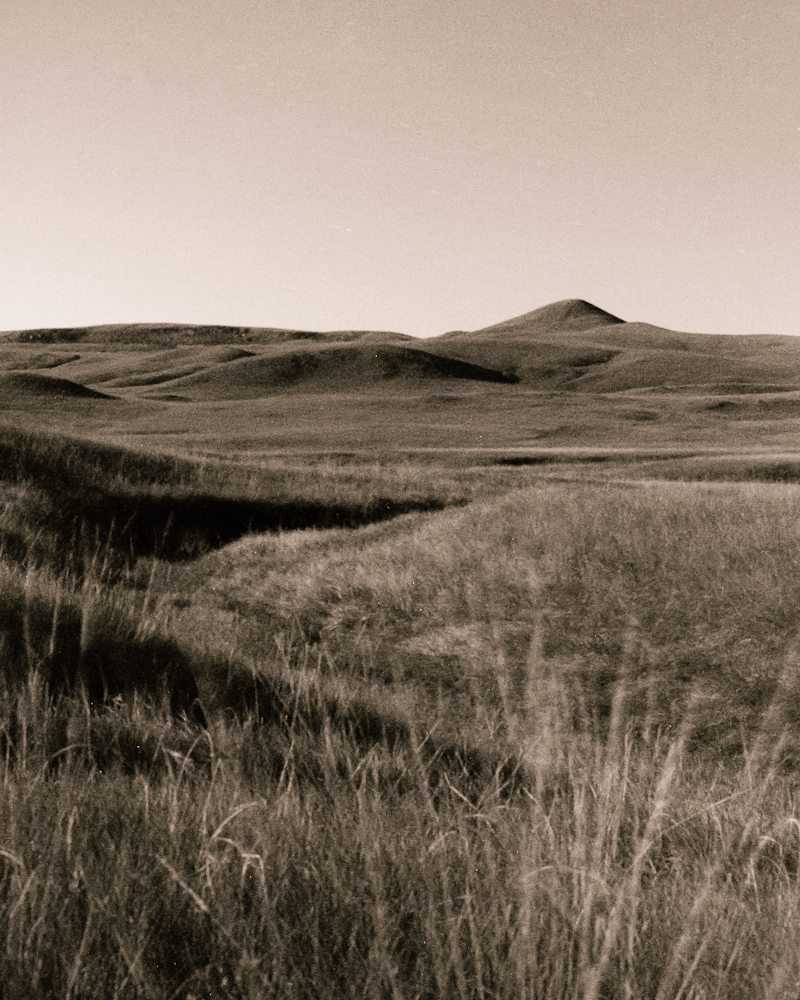
Continuing my summer photography, I present a series of photographs taken while roaming the trails at Jewel Cave National Monument. These are but a small fraction of the wildflowers that grow through the summer season in the Black Hills of South Dakota.

Model: Nikon D80
Shutter: 1/1000 sec
Exposure Program: Aperture Priority
F-Stop: f/2.5
ISO: 100 Focal Length: 35mm
Lighting: None
Model: Nikon D80
Shutter: 1/60 sec
Exposure Program: Aperture Priority
F-Stop: f/8
ISO: 100
Focal Length: 35mm
Lighting: None

Model: Nikon D80
Shutter: 1/320 sec
Exposure Program: Aperture Priority
F-Stop: f/1.8
ISO: 100
Focal Length: 35mm
Lighting: None
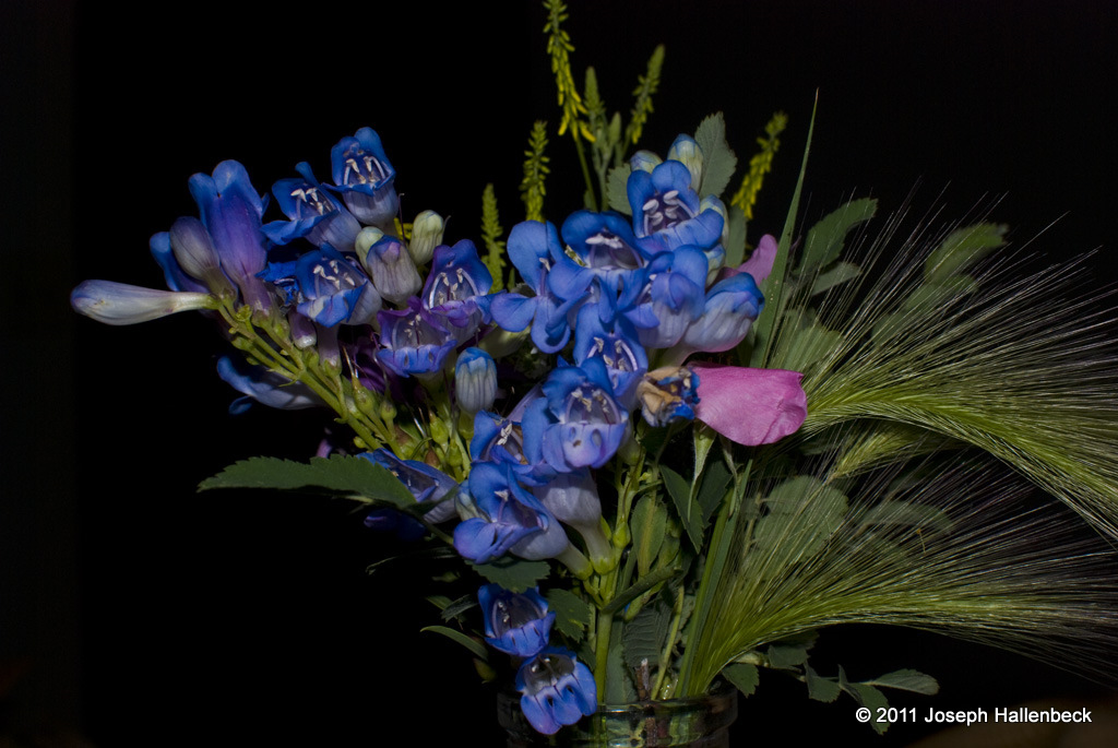
I have a long backlog of photographs from this past summer that I am beginning to work my way through and will be showcasing the best of over the next few weeks. I have a goal of attempting a showing of my photography in the Sioux Falls area sometime in the next nine months. I have had friends over the years doing showings at places like Black Sheep Coffee as well as at my alma matre, Augustana College and I hope to select a few prints to really work through in photoshop, professionally print, matte, frame, and display. The above photograph is a bouquet of wildflowers that I gathered along the Hell Canyon Trail in South Dakota for my girlfriend. This shot is taken indoors with on-camera flash at night. The flash readily illuminated the bright blue tones of the flowers while giving the room a nice black backdrop.
Model: Nikon D80
Shutter: 1/60 sec
Exposure Program: Aperture Priority
F-Stop: f/8
ISO: 100
Focal Length: 35mm
Lighting: On-camera flash, auto-mode

I am a rather shy person when it comes to photographing people I don’t know. Food, provides a good substitute. Particularly since food can be positioned and set out to take advantage of both artificial and natural light. The above photograph was taken at noon using natural light filtering in through my dining room window. The arrangement takes advantage of the strong diagonals created by the stone table and the red rose mirrors the tones of the hearty bowl of Russian borscht that I had prepared some weeks prior.
Model: Nikon D80
Shutter: 1/500 sec
Exposure Program: Aperture Priority
F-Stop: f/3.2
ISO: 200
Focal Length: 35mm
Lighting: Natural Light
Most of my favorite web comics are ones that I discover near the end of their runs. Michael Poe’s Exploitation Now!, Josh Phillip’s Avalon, or It’s Walky – I stumbled upon these near the end of their runs where I could sit down and spend several days reading through the archives. This last month, I embarked upon reading through the archives of two of my favorite web cartoonists: Michael Poe and Fred Gallagher.
The experience of reading through an archive is vastly different from following along as the comic is created. Often in the daily wait between new pages months or even years can go by between the appearance of minor characters and stretching long, convoluted plots out over months can cause many of the subtle details to be lost.
I prefer to read the archives online. I do buy the print editions to help the artists, but I find that one of the great aspects of web comics is that necessary beat – a brief “ah” while you wait for the next page to load. This gives me a moment to reflect upon the events of that page, to get caught up on the cliff hanger, and appreciate the art. A printed book is too easy to skip ahead, the pages fly by in a blaze. I try to remember to give that beat with a print comic and pause before I turn the page. Nevertheless, print artists fail to fully utilize that beat as effectively as web cartoonists.
Michael Poe’s Exploitation Now! was my introduction to web comics. I loved watching how the art and characters progressed from sketchy, one-dimensional creations into a complex fleshed out world. I am also rather impressed with Poe’s dark sense of humor that seems to fixate at times upon the more disgusting aspects of bodily existence. Poe’s more recent work, Errant Story, I liked not as much. In rereading the work from the beginning, I begin to understand why. In following the story the first time, I became confused by the complex place names and history. I became lost. In rereading the work, I caught all the history, all the characters and found myself actually enjoying the work just as much as Exploitation Now!.
Fred Gallagher’s Megatokyo, I began reading in 2004 and since then it has added nearly a thousand new pages. In all the mess of filler art days, guest strips, and hiatuses I became rather lost in the main storyline. Following it through a second time, I see why I enjoyed the work. Though it’s a long story and at present, I am only up to 2002.
My fourth, and perhaps last, season at Jewel Cave came to a close on September 10, 2011. I started at JECA in 2008 as a college summer job and I was surprised when I found myself going back to the cave again for three additional seasons. Leaving the park service was a sad, but necessary move, and although I forswore the city of Sioux Falls when I graduated college – it looks like I’m back again!
A lot of items have been on my plate over the last two months and only now am I starting to get a small breathe of air and an itch to get back to the creative projects such as The Wind-Up Blog, the webcomic, or some larger fiction and roleplaying projects that have gathered dust over the summer.
But what’s eaten up all my time?
GAGE E-Services offered me a position as a web developer at their Sioux Fall’s firm in July. I was hesitant to leave JECA mid-season, but they were willing to let me telecommute and work at JECA. This put me on a schedule of working a sixty-hour work-week through August and the first third of September putting together the news site of KVRR of Fargo, ND. On top of this is all the other mess of life - a new relationship, apartment hunting in Sioux Falls, enjoying the last summer in the hills, tending to various visitors, moving, unpacking, and learning the handle of a new job. The result is not a moment of peace these few months and when things did start to calm, I decided that I ought pause for a moment, play some games, read some books, and just chill.
I am not good at chilling.
After about a week, I was ready to poor myself back into labors: clean the apartment, unpack, update these blogs, update resumes, and start writing! So, expect to start seeing an outflow of material from my sites, and my mailbox once more.

I again returned to Jewel Cave’s Wild Caving Route with my camera to take photographs of the route. I find that the NPS Library for the route is rather sparse requiring our brochures to consist of photographs of visitors during tours rather than set photographs designed to illustrate the challenges of the route itself.
To get the equipment into the route is no easy challenge. The pelican cases are bulky and heavy. The plastic tends to cut into my side, throw me off balance, and generally turn an easy trail into a nightmarish pain. In order to minimize the time needed to carry the equipment, I opted for a shortcut. I traveled backwards on the route to a chimney (the “diving board”) that dropped down near the rope assist. I lowered the equipment down on rope then after the shoot climbed the chimney and deposited the camera at the end of the route.
The shots were taken as a rapid-fire mode since the exposure time at 1/10 on my 35mm prime lens at f/1.8 meant that quite a few came in blurry. The cave was lit using spare caving lights rather than flashguns due to the flashguns overpowering the shadows in the room. I shot some 48 shots over the extend of two climbs with only a handful of the shots coming out.
Wow! Over a month since my last post. Time as a Park Ranger get’s away from me during the summer. I want to be underground in the cave, above ground on the trails – everywhere with a camera and back at the apartment working on my art.
This last week I worked on sketching from screen captures of various music videos. The one selected for the blog is a sketch from Lady Gaga’s “Bad Romance.” Now, I must say that Gaga is not really my typical fair (I’d more of a Progressive/Post Rock fan with a long playlist of Yes, Coheed & Cambria, or Godspeed You Black Emperor!). Nevertheless, the directorial work in Gaga’s videos is astonishing and I’m blown away by the aesthetic detail and complex imagery conveyed through the likes of Gaga/Klein’s Alejandro, Gaga/Francis Lawrence’s Bad Romance, and Gaga’s Judas – I must commend the music videos for taking it quite a few steps beyond the normal fair and more over for their creepy design that’s remeniscint of Guillerno del Toro’s monster designs in *Pan’s Labyrinth *.
In some other semi-related news to my sketches, I’ve begun work on storyboarding a comic book adaptation of The Saga of the Volgsungs which will be my next work now that the first chapter in Ivan at the End of the World is coming to a close. I decided that I needed to work on my plotting and what better way to do then to steal a page from the bard and go rooting through old myths with established track records.
When I started the process of storyboarding Volgsungs I was imagining myself keeping the artwork rather similar to it’s Norse origins. However, as I began my music video sketches, I began to imagine the work taking a much darker “cyberpunk” feel – an adaptation that would set the work in a much more futuristic fascist state. The project is rather exciting to me, yet will be a long time in coming with all my other (see above!) summer side interests.
Continuing the sword-collecting series, I take a look at Muramasa for the Nintendo Wii. Before I begin, let me get it out of the way. I am a big fan of Vanillaware’s previous title, Odin Sphere, and the overall design philosophy of revisiting the game design challenges of two-dimensional design. It was a sad day when developers jumped ship for three-dimensional graphics, and I find it nice that there are still a few developers out there who, like me, would rather see the processing power of our new consoles put to envisioning the advances of the older two-dimensional genres.
In the case of Muramasa the current-generation variation of the side-scrolling action games revisits the action of the arcade days of yore. With the new technology however, comes an even faster-paced gameplay as dozens of enemies swarm across the screen swinging swords, throwing ninja stars, and battling the player. All of this is mixed together with a RPG-styled leveling system that encourages item collection.
My first impression of Muramasa is the sheer depth of the artwork which unravels like a fine painting. The orchestrated music fits perfectly with the gameplay enhancing the appreciation of the game’s atmosphere which drips from the screen into my eyes. Odin Sphere focused on variety by telling the tales of different characters each with unique fighting styles. The result was a bit rough. Some character’s combat systems were rock solid, others felt hacked together. Muramasa solves this by focusing on just two characters at their Obarahu style combat. The result? A very well polished combat system that is a thrill to play.
Not everything is good in Muramasa. Some of Odin Sphere’s mechanics were sadly cut. Planting fruit to grow new items, a mechanic I loved, is now gone; an unbalanced difficulty system gives you the choice of slicing through enemies like butter, moderate strategy, and insanely difficult; platform jumping is difficult to predict due to an unclear collision detection beneath the hand-drawn character sprite; and the battles can get tedious if played for a long sitting. Nevertheless, I would say Muramasa is the best third party Wii title out there – even though it makes no use of any Wii-specify hardware.
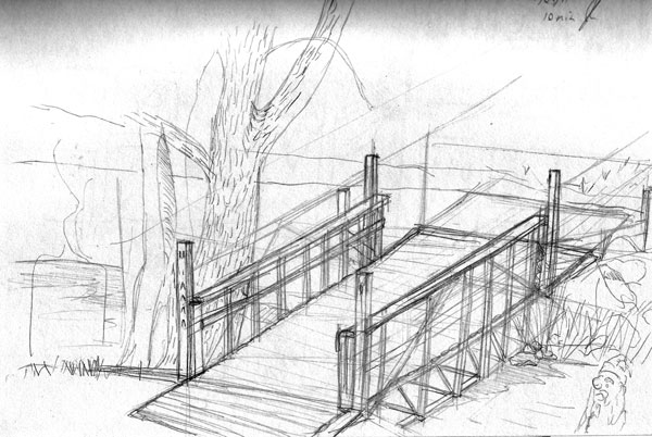
Not the best sketch ever, but I had to get something up for the week. Work on the comic continues to dominate my time, so I had only a few minutes in the week to work on any kind of sketching. This one is a quick draft of a canal bridge based off a photograph taken in southern Michigan.

I am back from a long break from web-posting due to settling back into the day-to-day routine of being a Park Ranger. The job takes a lot out of me, and I find little time in the evenings to work on projects. Yet, after four years of this, I think I have found how to take this job in stride. After a grueling day running around a cave, talking endlessly to visitors, and editing brochures – I get home and immediately shift gears to drawing, writing, and editing. Nevertheless, there is never enough time to get to everything, hence the drought of updates.
One task I was assigned last week was to photograph the cave’s natural entrance for a future exhibit. The sculptor for this exhibit needed example shots of the cave entrance so I was sent into the field with my camera and tripod to get shots of the entrance. My new tripod (a Manfrotto 055XPROB with a 229 Pro Head) works great for doing composition shots. The above is actually four separate shots taken with a telephoto lens (200mm) from the opposite canyon wall then edited together in photoshop. The tripod was precise enough to keep a level plane between shots making the editing procedure a piece of cake.
Here’s Cpt. Howell and Sam, the “villians” of my short-lived “Dreamscapes” webcomic.
I’ll be moving back to South Dakota over this week so I’m pre-posting comics for the next two weeks and hoping that they will all go live at the appropriate times. Thursdays will be filler-art days for the next two weeks due to the move as well.
This week’s filler is a character sheet where I was trying out different expressions for Ivan while trying to see how accurately I could redraw the shape of his head. I’m still not satisfied with the character of Ivan both as a character as well as his overall design. He might suffer a fate common to Mark Twain’s unloved characters and fall down a well.
I realized yesterday that the “Writing” link on the portfolio was broken. A quick fix for all those fans who want to continue reading my Kierkegaard thesis.
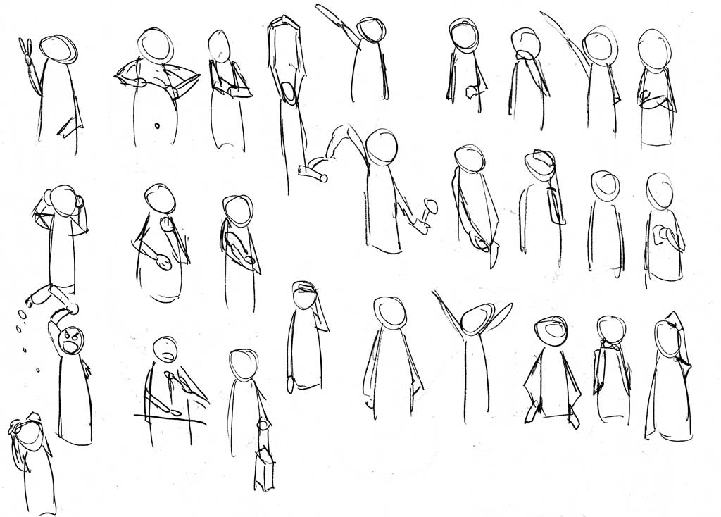
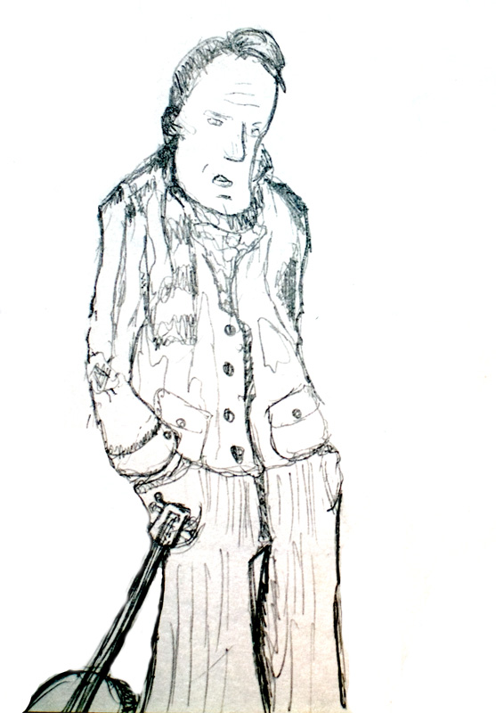
This week’s sketch journal is a little late due to the Easter holiday. I traveled south to Indiana to visit relatives over the weekend (but mostly to play fetch with their dogs, I do miss having a good lab to play fetch with). I promised myself to spend a great deal of time sketching on the trip, but alas promises soon fade. One item I did work on was gestures for comic book characters. I find that I have a very limited range of gestures in my current work, so I set out to draw as many different gestures as I could think up.
Following Super Mario Galaxy and Tokyo Magnitude 8.0, I began Katanagatari and Muramasa – a show about collecting swords and a game about collecting swords! Similar plots match similar settings, as both series are set in the early Genroku period shortly after the shogun unite the warring kingdoms of Japan. This week, I’ll take a look at Katanagatari.
In Katanagatari the protagonists, Togame the “Strategian” convinces Shichika, a swordsman (more like a marital artist) to help her collect twelve deviant blades of Shikizaki – whose power is fabled to grant dominion over the world if collected together. Together they travel Japan in an episodic battle-of-the-week format challenging ninja, swordsmen, and pirates to duals over these fabled swords.
I tend to avoid fighting animes because of the tendency for fight to dominate the episode. After all, if an episode has 25 minutes to both tell a story and showcase an epic battle, than the story tends to become little more than an excuse for fighting. Katanagatari escapes this flaw through it’s 50 minute episode length. With all this extra time, Katanagatari’s conversations can reach Bakemonogatari-lengths. This gives the work a much more feature-film-like pacing as we get to know the characters through long conversations over meals, bathing, and other breaks that typically won’t make it into the frantic pace of shorter animes.
White Fox, a relatively new studio showcases some amazing production values in the animation. Katanagatari’s character designs are unique and take some time to accept. This design focuses on simple characters with few, yet bold, lines and unornamented eyes that harkens back to the character designs of Osamu Tezuka. It is still common to see such designs in a lot of manga, nevertheless the interpretation of manga into animes often results in a bit of more (often unnecessary) flourish.
The backgrounds are a mixed bag. Some scenes portray sprawling countryside with a very traditional feel as though each is a water-colored painting – a similar style to those we might expect in Mushishi or a studio Ghibli film. Yet, once in the scenes_ Katanagatari_ quickly lose this detail for a much flatter computer-painted appearance.
At four episodes in, I find that Katanagatari has hooked me right into the adventure. I can see why ANN rates this series so highly and I find myself surprised that I held out on watching it for so long. I would encourage anyone who is looking for a good light-hearted action anime to give this a look. It’s short, enjoyable, well drawn, well plotted, and contains some very fun characters that (so far).
I’ve been very busy working on the script and sketches for my webcomic this week, so I had very little time to extra sketching on the side. So here’s a graphite scribble composing a couple different people I know into a single caricature.
I follow roughly thirty webcomics on a daily basis. I say roughly because this number tends to change a lot. I cull the collection about once a year to remove comics on hiatus and comics that I grew bored with. Yet, this is counterbalanced by binging on new webcomics. Once and a while, I’ll just start clicking on ads for new comics, dig through the links on my favorite comics and discover (or re-discover) new series to read. There are a few criteria that I look for in a new comic to follow:
This last week I had a cold, which gave me an excellent excuse to do nothing but binge on some new comics! My findings this time included a few oldies and one newer comic:
SMBC – This one has been around for a while. I tend to stumble across it once a month, read a bunch of random comics, laugh at it, and then forget about it. SMBC is a gag strip akin to XKCD or the Farside. SMBC’s following is a lot like XKCD’s following in so far as if you have a lot of geeky friends, they will send you these strips on a regular basis. The writing is amazing. As I poured through the archives I found myself laughing harder than I have in a long while.
Girl Genius – I stumble on Girl Genius at least once a year. It’s a hard series to get into. I started on the archive dozens of times, but once I realize that there’s nearly ten years of pages to read, I quit. I don’t quit because I hate Girl Genius, I quit because I love Girl Genius, It’s an amazing story with gorgeous detailed artwork that has layers upon layers of little visual jokes worked into an outpouring of details (how they succeed at doing three pages a week, I will never know). The result is an extraordinarily visually dense work that requires slow, careful reading to fully appreciate each page. This time I surmounted the challenge of reading through the first year’s worth of pages. After that, I was too hooked to stop. The plot starts off slow, but keeps ratcheting up the tension with each page until the entire story becomes a non-stop rollercoaster.
Living with Insanity – With only two years in it’s archive, this is a new one that I stumbled across. LwI is another ‘bizarre-slice of life’ series trying to be like Queen of Wands or Questionable Content. The illustration is decent but lacks distinction from other generic computer-aided illustrations. The plotting feels like it’s just stumbling along. The story arcs in the series tend to peter out halfway through, and the humor lacks the polish of the longer running series whose footsteps LwI is following. LwI tries to make up for this with the tactics perfected by Michael Poe – gratuitous sex, nudity, and fan service. I’m going to follow it, but it will probably not last the next culling.
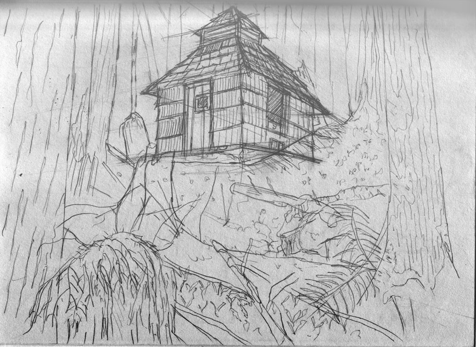
My second week of sketching focused on perspective using a rustic-era shed that I photographed in Olympic National Park. The sketch is primarily contour lines, but I hope to ink and shade it later this week which will improve upon its present “rough” look.
I started watching Tokyo Magnitude 8.0 just a few days before the quake hit Japan last month. For those who don’t know, Tokyo Magnitude 8.0 depicts the aftermath of an 8.0 magnitude earthquake centered on Tokyo. The creators of the show set out to deliberately create an accurate account of what such an event would be like that is, no over-the-top anime hijinks, no racy sexuality, no big-time explosions, none of the more fantastical elements we expect from anime.
I must admit, I am not a fan of realism, and with it’s strong emphasis on realism, Tokyo Magnitude suffers the problems I find with most of the realists: reality simply doesn’t have the same sense of narrative rise and fall and real people tend to have problems that, all and all, are rather boring. The result is rather undramatic narrative that feels like a school-room educational video. There is an earthquake (tense, exciting) and then the protagonists walk home (dull).
The animation of Tokyo Magnitude is rather superb, which is what I’ve come to expect from the Noitamina block. Indeed, I must admit my initial attraction to the show stems from the title cards for the series: each card depicts the city of Tokyo in a state of ruins. I wish I knew the artist responsible for the works as they remain some of my favorite cityscape pieces.
Yet, the series fails to live up to the artwork, which is really a disappointment considering the sheer talent (Studio Bones, e.g.* Darker than Black and Full Metal Alchemist*) responsible for the show’s execution. The story pacing feels like a short OVA drawn too thin over it’s eleven episodes. A tighter plot condensing the story into three episodes would have improved the narration, particularly since so few memorable events occur in middle of the series. Nonetheless, elven episodes it is.
Because of it’s 30% extra brightness, the full moon of March, 2011 was dubbed the “Super Moon.” This was some night photography I couldn’t pass up! This composite shot was taken from the shadow of Stonington Peninsula’s lighthouse looking eastward over Lake Michigan. The moon rose promptly at 8:15 as a bright orange ball and climbed over the lake. I took each of roughly thirty shots from my tripod, but a strong wind and cold ruined many of the takes.

The final result is a composition of two shots at different apertures. The first shot is adjusted to capture the clouds and details of the night sky, but this leaves the moon as bright as the sun. The second shot, taken from the exact same position but with a smaller aperture, captures the fine details of the moon’s craters. I edited the moon out of the first shot and replaced it with the detailed moon of the second shot to capture an appearance that accurately reflects the experience of seeing the Super Moon.

A second difficulty is the colors. Taken with long exposure times, the moon comes out bright orange. Yet, we associate the moon with whiteness (rather than bright red like a sunset). If we want the moon to look closer to how we associate it, we must apply a cooling filter to the image to adjust out the red tones and replace them with the blue tones we normally associate with the moon. The result is the picture to our right.
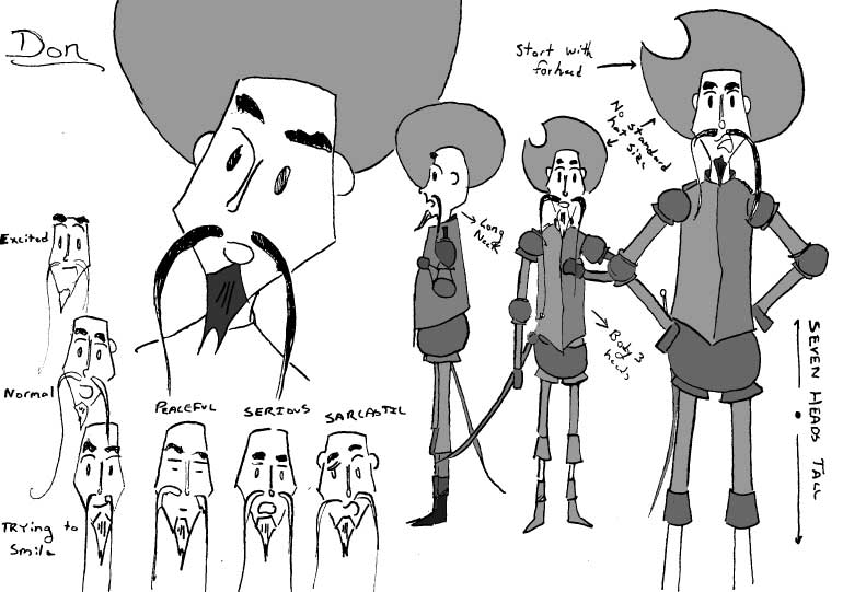
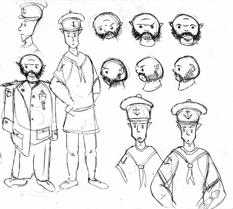
The process of working on the comic continues and today I present my draft sheet for the character of Don.
I tried on this sheet to experiment a little with his design. For one, out of all the character’s Don was the most complete out-of-the-box. He is based on a statue of Don Quixote that my drawing professor at Augustana had us draw. Indeed, many of these characters are based on weird statues he had us draw. Thus, when it came time to draw his character sheet, I decided to experiment. I colored in his mustache, removed the bandeliers and tried for a more realistic shape to his breastplate. In the end, I think I liked him just the way he was.
A second bit of experimentation comes in the inking. Previously, I inked with brushes, but I decided that I ought to be more discerning with them. For example, Tamar Curry’s Lumia’s Kingdom (whose artwork I admire) tutorials show him inking with dip pens. I love dip pens for my scenery look, but kept to brushes for characters and organics even though I find brushes much more difficult to use. On this sheet, I went with dip pens throughout, and the result? The lines look less confident on the larger images and far too uniform. Yet, in Ivan’s character sheet (coming up next!) I discovered that the brushes really do work – I just need to double or triple the size of my character drawings. Pens work well for the fine details of the backgrounds and smaller depictions of the characters (less than 1” tall heads), but once I get into having 2” - 3” tall heads, the brushes look much more graceful and overall 9” tall characters seem to be easier overall to draw.
Having done Zelda and now Mario, I think I might end up with a long run of Nintendo-game-related articles.
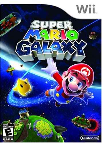
Super Mario Galaxy was one of the launch titles for the Nintendo Wii back in 2006 when the system was still nigh impossible to find on store shelves. Wait a few years and it becomes surprisingly easy to find, however, not cheaper. Unlike Sony, who tends to drop their best-selling title prices soon after launch, Nintendo keeps prices high and even today a copy of Mario Galaxy runs for $40.54 on Amazon, a mere $6.37 cheaper than it’s recently released sequel. Writing a review of such an old game on a gaming-blog is probably preaching to the choir. Get used to it, I plan on writing many more articles about even older hit titles.
Super Mario Galaxy contains the same amount of plot expoltation as the original Super Mario for the NES: a hair-thin plot of a giant turtle kidnapping a princess, and the red-suited man who goes to save her. Mario is and never was much for plots, nor should it be! Mario is all about giving someone an excuse to explore the imaginative spaces of level designers. The collecting of coins, stars, and defeating of bosses are just a thin glossing to give gamers incentives to pick around through each of the game’s many “galaxies.” Because of this, Super Mario Galaxy realizes, much better than Super Mario Sunshine, the game-play that made Super Mario 64 so compelling to play through and complete.
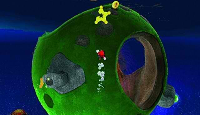
To get an idea of Super Mario Galaxy’s gameplay simply imagine Super Mario 64, but wrap each stage into a sphere with its own gravitational pull. Mario leaps, bounces, and flies between these spheres landing on one or another and often running up walls. Intermixed amongst this is more traditional levels in which gravity is clearly down and leaping off the edge causes death.The opening stage expresses the creative potential of the game and the gravity-bending aspects will contribute to future stages as they produce increasingly surrealistic playgrounds for exploration.
At this point in the game my only complaint is against the musical score and progression. The tempo, much faster than earlier Mario games, tended to discourage idle exploration in the earlier stages. I felt rushed to run through each level, grab the star and move on to the next level. Perhaps because of this fast tempo, the rewards in the early stages come too quickly. I collected many of the stars necessary to unlock the advanced stages in just a few hours, and (to my surprise) was able to beat the game with only 60 of the 120 stars in the game. Thus, I beat Koopa long before I even had a taste of the game’s true potential. I can imagine that this quick progression is because of the title’s launch status. If Nintendo intended this game to attract new gamers than a difficult learning curve might put them off from future game purchases.
Super Mario Galaxy wins back whatever scorn I might put upon it in the latter half of the game. After beating Koopa, all new coin-collecting stages appear which encourages a much more methodical approach to the galaxies. The pacing also slows in later galaxies and the time spent completing puzzles in a level to advance and collect each star lengthens as the levels progressively get larger and more complex. The result is that the more experienced gamer who progresses on to collect all 120 stars is rewarded with a much more engaging game even while the new-comer can collect the reward of “winning” early on. Secret stars compound this by sending Mario back to old galaxies looking for alternative routes to completing each stage, and “prankster” comets mix up the levels by adding extra difficulty through time-limits, faster enemies, ghost-races, and on-hit-kills health.
It took me 20 – 30 hours of play to collect all 120 stars in Super Mario Galaxy, which puts it on par with the length of most contemporary games. As an introduction to the Nintendo Wii, I think Super Mario Galaxy makes a great game and one that I think Nintendo hoped would demonstrate the possibilities of reinvisioning older game genres with their new control scheme. It is a pity that Wii Sports became the real champion of the system rather than Super Mario Galaxy, as there is a glut of mini-game Wii titles, and very few platformers of Super Mario Galaxy’s caliber.
I dabbling more and more with JavaScript lately. In the past my solutions to most site-related problems has been to write server-side PHP modules to add whatever functionality I needed. Since I started using WordPress to manage my site content, I started finding myself using JavaScript to ease-up on the amount of html that I need to type into my post boxes. Take Lightbox for an example. Lightbox is a pretty amazing piece of JavaScript that easily creates animated slideshows out of a series of image links. I use it on my art and photography pages. The problem with Lightbox? Telling Lightbox to animate a link rather than just link straight to the pictures is very verbose. For example to create this animation:
 “This ink wash panel from my webcomic ‘Ivan @ the End of the World,’ shows my growing interest in the use of water-based ink washes to depict gradient shading in my works.”
I need to type the following into WordPress:
<span style="color: #009900;"><<a href="http://december.com/html/4/element/a.html"><span style="color: #000000; font-weight: bold;">a</span></a> <span style="color: #000066;">title</span><span style="color: #66cc66;">=</span><span style="color: #ff0000;">"This ink wash panel from my webcomic Ivan @ the End of the World, </span>
<span style="color: #009900;">          shows my growing interest in the use of water-based ink washes to </span>
<span style="color: #009900;">          depict gradient shading in my works."</span></span>
<span style="color: #009900;">   <span style="color: #000066;">rel</span><span style="color: #66cc66;">=</span><span style="color: #ff0000;">"lightbox[sketch]"</span> </span>
<span style="color: #009900;">   <span style="color: #000066;">href</span><span style="color: #66cc66;">=</span><span style="color: #ff0000;">"/images/art/sketch_ivan.jpg"</span> ></span>
    <span style="color: #009900;"><<a href="http://december.com/html/4/element/img.html"><span style="color: #000000; font-weight: bold;">img</span></a> <span style="color: #000066;">class</span><span style="color: #66cc66;">=</span><span style="color: #ff0000;">"aligncenter"</span> </span>
<span style="color: #009900;">         <span style="color: #000066;">src</span><span style="color: #66cc66;">=</span><span style="color: #ff0000;">"/images/art/sketch_ivan.jpg"</span> </span>
<span style="color: #009900;">         <span style="color: #000066;">alt</span><span style="color: #66cc66;">=</span><span style="color: #ff0000;">"Ivan Panel"</span> <span style="color: #000066;">width</span><span style="color: #66cc66;">=</span><span style="color: #ff0000;">"60%"</span> <span style="color: #66cc66;">/</span>></span>
<span style="color: #009900;"><<span style="color: #66cc66;">/</span><a href="http://december.com/html/4/element/a.html"><span style="color: #000000; font-weight: bold;">a</span></a>></span>
Why so much text? First, Lightbox uses the anchor’s title attribute to generate a caption rather than the image’s alt text. The result is the repetition of the string value for the alt and title attributes. Second, lightbox uses the anchor tag’s href value to direct the browser to load the full resolution image. This allows the image tag to point to a smaller thumbnail picture. Yet in most cases of blogging, the thumbnail is just the original picture reduced to fit into the blog’s div. If this is the case than the href attribute on the anchor is merely replicating the src attribute on the image tag. What we really want, is to shorten the monstrosity above into this:
<span style="color: #009900;"><<a href="http://december.com/html/4/element/a.html"><span style="color: #000000; font-weight: bold;">a</span></a>></span>
    <span style="color: #009900;"><<a href="http://december.com/html/4/element/img.html"><span style="color: #000000; font-weight: bold;">img</span></a> <span style="color: #000066;">class</span><span style="color: #66cc66;">=</span><span style="color: #ff0000;">"aligncenter"</span> </span>
<span style="color: #009900;">         <span style="color: #000066;">src</span><span style="color: #66cc66;">=</span><span style="color: #ff0000;">"/images/art/sketch_ivan.jpg"</span> </span>
<span style="color: #009900;">         <span style="color: #000066;">alt</span><span style="color: #66cc66;">=</span><span style="color: #ff0000;">"This ink wash panel from my webcomic 'Ivan @ the End of the World,' </span>
<span style="color: #009900;">              shows my growing interest in the use of water-based ink washes to </span>
<span style="color: #009900;">              depict gradient shading in my works."</span> <span style="color: #000066;">width</span><span style="color: #66cc66;">=</span><span style="color: #ff0000;">"60%"</span>></span>
<span style="color: #009900;"><<span style="color: #66cc66;">/</span><a href="http://december.com/html/4/element/a.html"><span style="color: #000000; font-weight: bold;">a</span></a>></span>
So much shorter! But how? The solution is in a very simple JavaScript function that I wrote which adds the Lightbox script to all images surrounded by empty anchor tags:
<span style="color: #339933;">*</span>  lightboxThis is a convenient method <span style="color: #000066; font-weight: bold;">for</span> transforming all anchored
<span style="color: #339933;">*</span>  images <span style="color: #000066; font-weight: bold;">in</span> a specified div into lightbox images. <span style="color: #660066;">To</span> use
<span style="color: #339933;">*</span>  lightboxThis call it during the onload event <span style="color: #000066; font-weight: bold;">in</span> the  tag
<span style="color: #339933;">*</span>  and pass it the divId <span style="color: #000066; font-weight: bold;">for</span> images that should be lightboxed.
<span style="color: #339933;">*</span>  <span style="color: #339933;">@</span>param string divId The unique id<span style="color: #339933;">,</span> all images wrapped <span style="color: #000066; font-weight: bold;">in</span> empty anchor
<span style="color: #339933;">*</span>   tags <span style="color: #009900;">(</span><span style="color: #339933;">&</span>lt<span style="color: #339933;">;</span>a<span style="color: #339933;">>&</span>lt<span style="color: #339933;">;/</span>a<span style="color: #339933;">></span><span style="color: #009900;">)</span> <span style="color: #000066; font-weight: bold;">in</span> the specified div will be transformed into
<span style="color: #339933;">*</span>   lighbox images. <span style="color: #660066;">Note</span><span style="color: #339933;">:</span> <span style="color: #000066; font-weight: bold;">this</span> method uses the img alt attribute
<span style="color: #339933;">*</span>   to determine the caption and will only work <span style="color: #000066; font-weight: bold;">if</span> an alt tag is
<span style="color: #339933;">*</span>   included <span style="color: #000066; font-weight: bold;">in</span> each image<span style="color: #339933;">,</span> <span style="color: #000066; font-weight: bold;">if</span> no caption is desired <span style="color: #000066; font-weight: bold;">set</span> the alt
<span style="color: #339933;">*</span>   attribute to alt<span style="color: #339933;">=</span><span style="color: #3366CC;">" "</span>.
<span style="color: #339933;">*</span>  <span style="color: #339933;">@</span>param optional bool group If <span style="color: #000066; font-weight: bold;">this</span> parameter is <span style="color: #000066; font-weight: bold;">set</span> to <span style="color: #003366; font-weight: bold;">true</span> than
<span style="color: #339933;">*</span>   lighboxThis will group all images <span style="color: #000066; font-weight: bold;">in</span> the specified div into
<span style="color: #339933;">*</span>   a lighbox group with the name of the unique div id as the
<span style="color: #339933;">*</span>   group name <span style="color: #009900;">(</span>e.<span style="color: #660066;">g</span>. <span style="color: #660066;">rel</span><span style="color: #339933;">=</span><span style="color: #3366CC;">"lighbox[divId]"</span><span style="color: #009900;">)</span>
<span style="color: #339933;">*/</span>
<span style="color: #000066; font-weight: bold;">function</span> lightboxThis<span style="color: #009900;">(</span>divId<span style="color: #339933;">,</span> group<span style="color: #009900;">)</span> <span style="color: #009900;">{</span>
    <span style="color: #000066; font-weight: bold;">var</span> anchors <span style="color: #339933;">=</span> document.<span style="color: #660066;">getElementById</span><span style="color: #009900;">(</span>divId<span style="color: #009900;">)</span>.<span style="color: #660066;">getElementsByTagName</span><span style="color: #009900;">(</span><span style="color: #3366CC;">"a"</span><span style="color: #009900;">)</span><span style="color: #339933;">;</span>
    <span style="color: #000066; font-weight: bold;">for</span> <span style="color: #009900;">(</span>i <span style="color: #339933;">=</span> <span style="color: #CC0000;">0</span><span style="color: #339933;">;</span> i <span style="color: #339933;">&</span>lt<span style="color: #339933;">;</span> anchors.<span style="color: #660066;">length</span><span style="color: #339933;">;</span> i<span style="color: #339933;">++</span><span style="color: #009900;">)</span> <span style="color: #009900;">{</span>
        <span style="color: #000066; font-weight: bold;">var</span> innerChild <span style="color: #339933;">=</span> <span style="color: #CC0000;">0</span><span style="color: #339933;">;</span>
    innerChild <span style="color: #339933;">=</span> anchors<span style="color: #009900;">[</span>i<span style="color: #009900;">]</span>.<span style="color: #660066;">getElementsByTagName</span><span style="color: #009900;">(</span><span style="color: #3366CC;">"img"</span><span style="color: #009900;">)</span><span style="color: #339933;">;</span>
    <span style="color: #000066; font-weight: bold;">if</span> <span style="color: #009900;">(</span>innerChild<span style="color: #009900;">[</span><span style="color: #CC0000;">0</span><span style="color: #009900;">]</span> <span style="color: #339933;">&&</span> <span style="color: #339933;">!</span>anchors<span style="color: #009900;">[</span>i<span style="color: #009900;">]</span>.<span style="color: #660066;">href</span><span style="color: #009900;">)</span> <span style="color: #009900;">{</span>
        anchors<span style="color: #009900;">[</span>i<span style="color: #009900;">]</span>.<span style="color: #660066;">href</span> <span style="color: #339933;">=</span> innerChild<span style="color: #009900;">[</span><span style="color: #CC0000;">0</span><span style="color: #009900;">]</span>.<span style="color: #660066;">src</span><span style="color: #339933;">;</span>
        anchors<span style="color: #009900;">[</span>i<span style="color: #009900;">]</span>.<span style="color: #660066;">title</span> <span style="color: #339933;">=</span> innerChild<span style="color: #009900;">[</span><span style="color: #CC0000;">0</span><span style="color: #009900;">]</span>.<span style="color: #660066;">alt</span><span style="color: #339933;">;</span>
        <span style="color: #000066; font-weight: bold;">if</span><span style="color: #009900;">(</span><span style="color: #339933;">!</span>group<span style="color: #009900;">)</span> <span style="color: #009900;">{</span> anchors<span style="color: #009900;">[</span>i<span style="color: #009900;">]</span>.<span style="color: #660066;">rel</span> <span style="color: #339933;">=</span> <span style="color: #3366CC;">"lightbox"</span><span style="color: #339933;">;</span> <span style="color: #009900;">}</span>
            <span style="color: #000066; font-weight: bold;">else</span> <span style="color: #009900;">{</span> anchors<span style="color: #009900;">[</span>i<span style="color: #009900;">]</span>.<span style="color: #660066;">rel</span> <span style="color: #339933;">=</span> <span style="color: #3366CC;">"lightbox["</span><span style="color: #339933;">+</span>divId<span style="color: #339933;">+</span><span style="color: #3366CC;">"]"</span><span style="color: #339933;">;</span> <span style="color: #009900;">}</span>
    <span style="color: #009900;">}</span>
    <span style="color: #009900;">}</span>
<span style="color: #009900;">}</span>
If you’re interested in implementing this on your own blog simply copy the function into your WordPress theme’s header and surround it with tags. Then you need to add the following to your theme’s <body> tag:
body onload<span style="color: #339933;">=</span><span style="color: #3366CC;">"lightboxThis('blog_area')"</span><span style="color: #339933;">></span>
Where ‘blog_area’ is the name for the div id where your blog’s posts reside.
A friend of mine (Alex Stommes) started keeping a sketch journal last summer. His plan was to post a sketch every day to the journal. The idea of this process was that it would encourage an active involvement in the art and a deadline to produce something each day. I found the idea intriguing and the results quite superb. By the end of the summer he improved immensely, and he continues to post new material regularly.
I wanted to start my own journal, but with my all my ongoing projects keeping a daily journal would require far more commitment than I could muster. Nonetheless, I still want to try, so I’m starting a weekly sketch journal. Every Friday, I will post something that I’m working on and hopefully this will encourage me to draw something each week (even if it’s just furiously scribbling at 11:30 PM on Friday night).
First and foremost, I would like to announce the launch of the Wind-Up Culture Blog, my newest blog with a focus on my eclectic taste in film, literature and games. I hope that this (broader) topic will draw a larger audience of readers than my last failed attempt at creating a blog. Anyways, check over there as I hope to keep it regularly updated with reviews, critiques, and commentary about popular art in general.
You may notice some minor changes to this site. First, I’ve moved all of my sites from JustHost over to a shiny new space at HostNexus and as promised, the portfolio is now completely dynamic. The old-design used static web-pages so that I could distribute the portfolio on CDs without needing to include something like Server2Go. Since then, I’ve yet to find a studio that wants a disc version of the portfolio, most demand an online website. The new site also has some refinements to the text-size (it’s now relative for better accessibility), cleaned up CSS, and better handling of white-space to be more appealing. I debated the use of serif fonts, but decided to keep them despite the superior online display of sans-serif text.
I also refocused the purpose of the site. Since right now, I’m searching for full-time employment, I feel that I ought to move away from giving the impression that I’m looking for contract work and to instead focus the portfolio predominately as a place to represent my completed projects, ongoing skill development, and ongoing creative projects. If I decide to make a serious attempt at contracting, I will compose a studio site and formally charter a business.
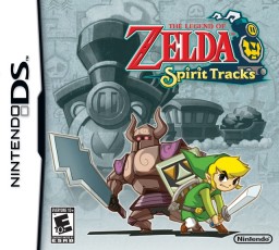
As I grow older, I increasingly become one of those gamers who spends a great deal of time reading about the hobby rather than doing it. In-between becoming a curmudgeon who complains about how they just don’t make games like they used to, I find a few games that still capture my attention. Zelda: Spirit Tracks would be one such game.
I would love to speak fondly of how Spirit Tracks embodies the wide open spaces of Ocarina, or how the interlocking and complex dungeons rivaled the masterful level design of Link’s Awakening.
Unfortunately, I cannot. The curmudgeon must come out and point out how Spirit Tracks is quite literally a game on rails. The vast sweeping steppes of Hyrule which opened up for exploration in Ocarina are no more. This new system, pioneered in the previous DS title restricts Zelda’s classical theme of exploration into a mindless grind of watching scenery fly by a train’s window.
I ought to write at great length about the more Zen aspects of Zelda, how the wandering about the luscious natural settings of an adventure game mimics the experience of a Japanese rock garden. I might point out that Miyamoto once said that he hoped that the Mario and Zelda games would elicit such an aesthetic. Nonetheless, such would be for a much longer, and vastly more academic piece. I would say that Spirit Tracks retains only a shadow of these traits. Once outside of the train, there are places to walk about, but they lack real defining character and were too small to allow me to poke around and really explore the space.
Spirit Tracks is easy. This should come as no surprise as Zelda titles started sliding into the easier realm some time ago. For the old-school gamer (or the hardcore masochist) who enjoys a good round of nigh-impossible difficulty, Spirit Tracks will disappoint. Nevertheless, for those whose skills have atrophied from the demands of “adult life,” Spirit Tracks fits the mold of a good casual distraction.
The one saving grace for Spirit Tracks is its pacing. The dungeons are small, but this has the benefit of dividing the game into bit-sized chunks. Plowing through a dungeon in an hour was standard. For a short-on-time gamer, this made playing through Spirit Tracks a very enjoyable experience. It may not possess the grace of the earlier Zelda titles, but at least it is a small bone to us adventure gamers.
The blazing orb had long fled the western skyline.
And on the fifteenth hour of a run across the Midwest
with only headlights to cut a tunnel through the void,
I swam, like a smelt amongst trout,
down the asphalt American stream.
Careless of me,
the giants loomed from the night-fog,
carrying their hidden cargo,
to destinations unknown.
I sat in my shell,
protected from the cold exterior,
the flaying winds,
and the night sounds.
In that rattling chamber
I rocketed across the land-locked interior.
The AM stations guided my way.
The mouth of the radio spoke
the world of conspiracy theorists, alien abductees.
The everyday madness of this nation spread
out before me.
The sun raced to meet me on the eastern shore
and even the freaks must sleep.
Not I.
– The VLP Magazine 2010 A Fortune Up In Flames
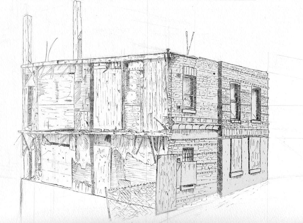
I returned to drawing in my final year of college following a half-decade hiatus. Akin to my photographic work, I tend to focus on space and atmosphere. The interconnections of parts forming into textures, brisk ink lines and sharp architectural shapes with muted or monochromatic colors fascinate me.
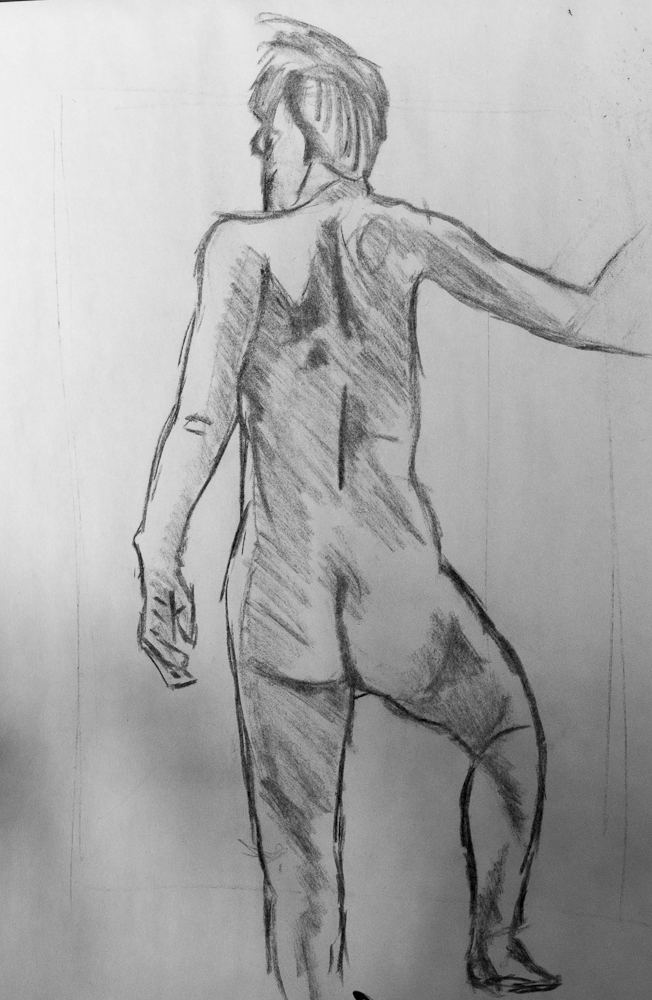
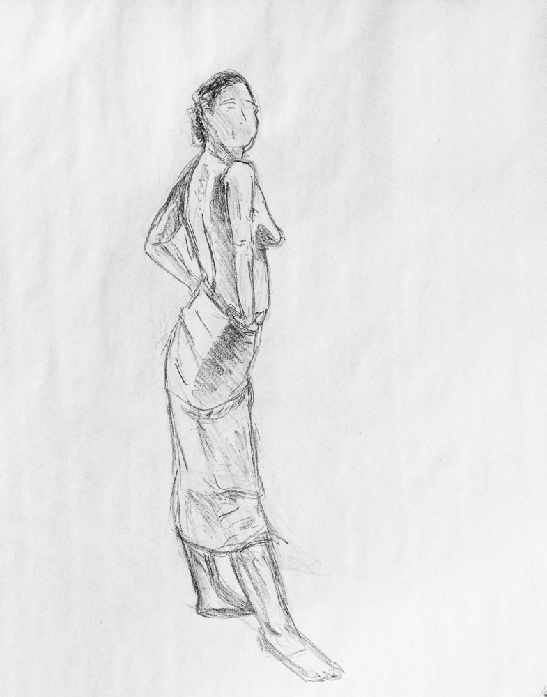
In recent years, I have taken to community figure drawing sessions to enhance my skills outside of still life. I aspire towards integrating illustration, and particular sequential art into my narrative storytelling.
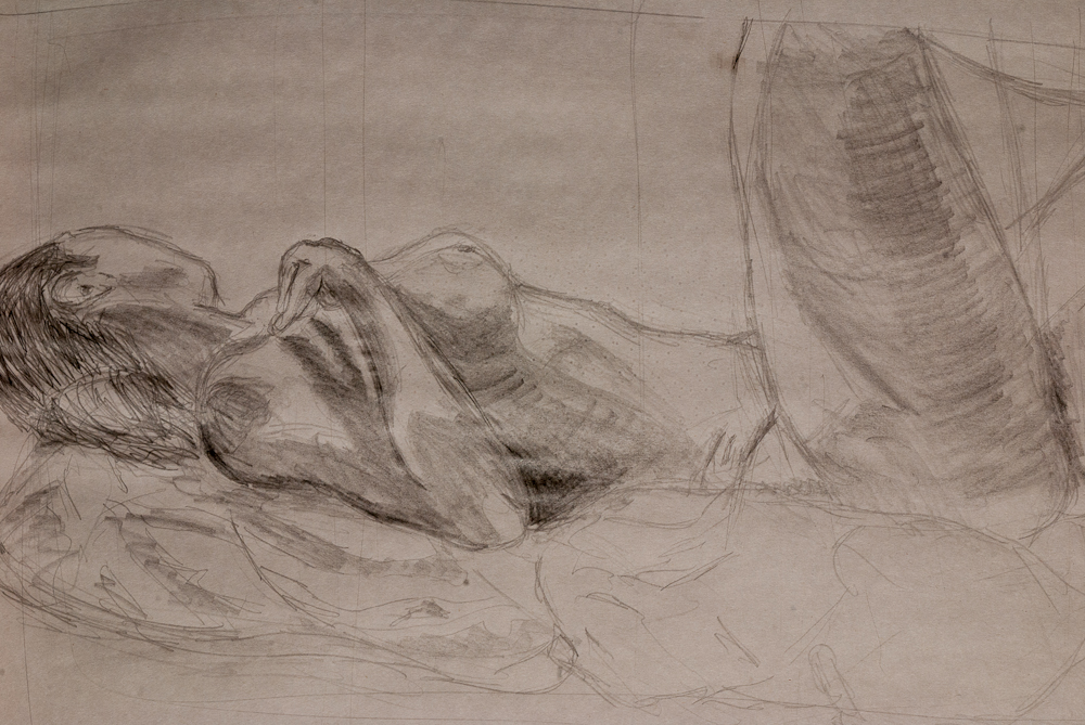
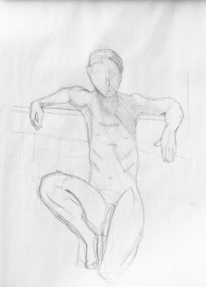
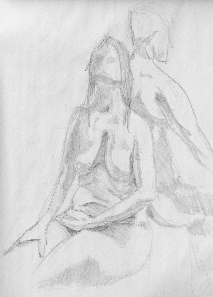
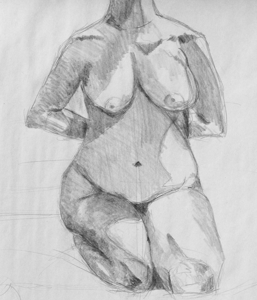
After five years of hauling it through caving expeditions, European bicycling trips and countless backpacking expeditions, my Nikon d80 seems a nigh indestructible tool.
My photographic work, a hobby I picked up during a college trip abroad, focuses principally on nature and those spaces that I think capture the revelation of the the sublime in a particular space.
As such, I tend to work mostly with natural lighting using prime lenses to compose my observations.
My photographs have been featured in a number of National Park Service publications related to Jewel Cave National Monument and in advertisements promoting the Black Hills of South Dakota.
Below, I have selected a small collection of some of my favorite shots from the last few years.


If you actually read my blog entries you might begin to notice a very nice pattern to them. It begins “I promise to start updating!” Soon after making such a promise, I look at the comics to come and realize that they suck. I drag my feet on releasing them. I dabble with just starting over. I draw some character sketches. I “practice” my inking. So very many excuses, and fortunately, so very few readers to complain!
My excuse this time? I am working on the script and the background. When I began to write up the background, I found myself really getting into it. Suddenly characters had purpose, the world had a map, and the plot flowed out. However, I noticed some problems. First, much of what I wanted to do with the characters ran contradictory to what the comic already established. If I continued posting the present line of comics unedited, I would only push myself further from my plans.
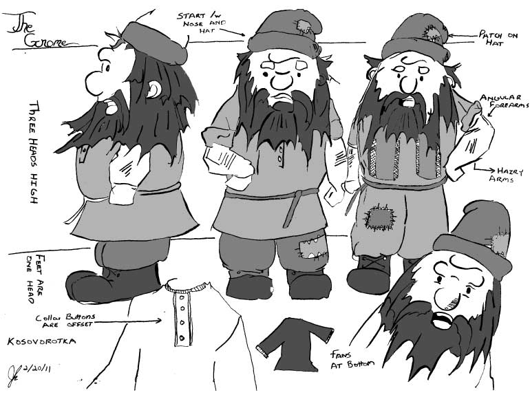
Instead, you get more filler art and this week’s entry is the Gnome.
Who is the Gnome? Well he is a gnome of course! In appearance, he is a short, angry little earth spirit who was quite fed up with the big people of the world bumbling into his affairs. Already, the comic establishes that his manners are rather lacking and he is fond of arguing.
The Gnome was the first character whose design came together. I started with a big circle for the nose, then the rim of the hat above, then drew tuffs of hair sticking out from beneath, forming a circle around his face. The Gnome’s body extends out from the edges of the beard to make a barrel shape. His cloths are rather traditional. Whenever I imagine Gnomes or Dwarves in their casual wear it’s always in the form of big boots, baggy trousers, and a tunic of some sort. In the case of this dwarf his tunic is a kosovorotka, a traditional Russian shirt known for its skewed collar. Out of everyone, the Dwarf has been at the End of the World the longest, and so his clothing is ragged and patched from many years of use.
 Continuing the series of character sheets from the past two days. . .
Today, let’s look at the 1200DPI scan of the character sheet. The higher-resolution scan resulted in a 75MB TIFF image that crawled even my design rig to a halt. I put the 1200DPI scan through the same process as the 300DPI scan, but this time I found a surprising change when it came time for live-tracing. The Illustrator traced the image correctly without my fiddling with the threshold! I still had the nice smoothing effect that live trace gave to my inks, but with the higher resolution it kept the finer details of the faces and smaller arcs. It also enclosed more of the spaces making the live paint process a much smoother operation that required only a minimum amount of readjusting the automated gap finding.
So my conclusion? Scan big!
I continue the parade of character sheets from yesterday.
Recall that I mentioned scanning the sheet at both 300DPI and 1200DPI, the result of the lower-resolution scan is what we will examine today. After scanning the sketch, I opened Photoshop and adjusted the levels (Image > Adjustments > Levels or Image > Adjustments > Curves) to give the inked lines a rich black look. Then I placed the image into illustrator and set the program to live trace. The benefit of live trace is two fold. Illustrator inks much better than I. The results smooth out many of the “shaky hand” errors, closes up gaps, and gives the image a much more unified tone. It also allows live paint, which turns coloring the work into a paint-by-numbers process of picking a swatch color and then clicking to fill the spaces inside the contour lines – much less time consuming than shading with ink washes.
Three problems immediately became apparent.
First, fine details such as the faces disappeared. This required a good deal of fine tuning of live trace’s “threshold” option. If I pushed the threshold too high the thicker lines became massive black smudges that lost much of their details, but if I dropped the threshold too low smaller lines disappeared. The result was a balance of the two extremes that failed to adequately capture the details of the original inking.
Second, live trace smoothed over much of the finer line arcs. This is most noticeable on the two center characters. The profile version loses the arc that defined her upper lip, creating what looks like a single curve from the tip of the nose to the chin rather than two smaller arcs. The face of the forward character loses definition in her shape. The original image showed the left-side of her face having much sharper angles.
Third, and this became evident only once I began live painting. The loss of finer details meant that many of the lines no longer connected to create enclosed coloring areas. The live paint process thus became much more tedious as I had to either fine tune the gap-fill, or go into the pen tool and move many of the lines closer together to enclose gaps so that I could easily color.
The solution? Quite easy, but I’ll get into that tomorrow. . .
The campaign continues as I work to spread my resume about to those employers who would take me. Nonetheless, morale weakens and I find myself dabbling more and more in various research projects. I assessed my skills over Christmas, and found myself rather diverse. I am a writer, graphic designer, photographer, and programmer. Fitting all of those into one job title is difficult. Fortunately, I find that a lot of rural areas I’m looking at are looking for weird hybrid web developers. Rural organizations are more likely to want someone who can design, code, and draft content for a site – an all-in-one package like myself! (Now, if only they would hire me.)
Last year, I devoted myself to working on art and writing. The result was the successful publication of some poetry, the creation of a few blog sites, and the income of $16.85 for four months of work.
Perhaps blog writing won’t pay the bills after all. Than again, picking something as obscure as cynical philosophy was a poor choice. The people who understand the humor of cynical philosophy are few. The people who will misinterpret cynical philosophy, and think me mad, are many. Thus, I decided to retire thedoggedphilosopher.com to subdomain hell, and will soon replace it with a new blog focusing on providing cultural commentary for such geeky subjects as comics, games, anime, film, and literature.
Speaking of geeky, my webcomic “Drifting in the Sea of Nihilism” will begin regular biweekly updates starting next Monday (now with improved writing and art).
I would be happy to fall into any one of the careers that use my abilities. I would be ecstatic to make a living off comics and writing. Nonetheless, looking at the job market for Montana I see only one of my skill-sets that regularly pops up: web development. Well, if this is what the people demand, than so be it!
My regiment for this year is rigorous. I want to get atop the entire web development field and get myself into the cutting edge of skills. I set up a reading list including everything from discrete mathematics, design patterns, and new web technologies to items like business and project management. Already I reread my texts on PHP, MySQL, Apache, Illustrator, and Flash (in one month), and I have new texts on web security, ajax, and PHP design patterns in the mail.
I have some killer projects planned out for the following months – projects that will test my skills and serve as ideal portfolio pieces. Here’s a list of possible ideas:
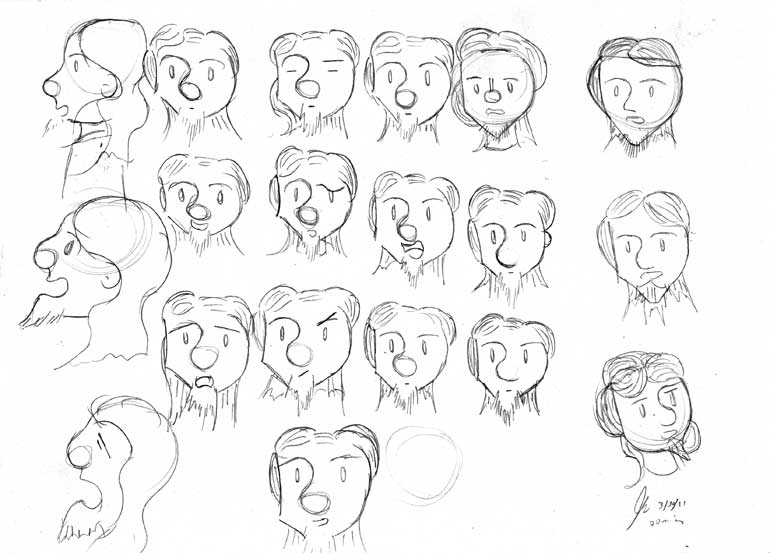
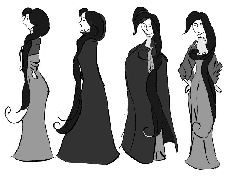
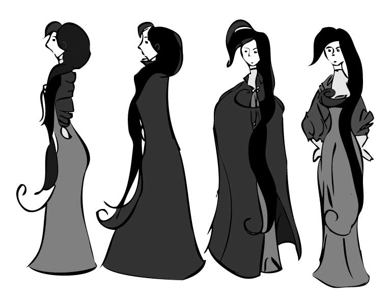
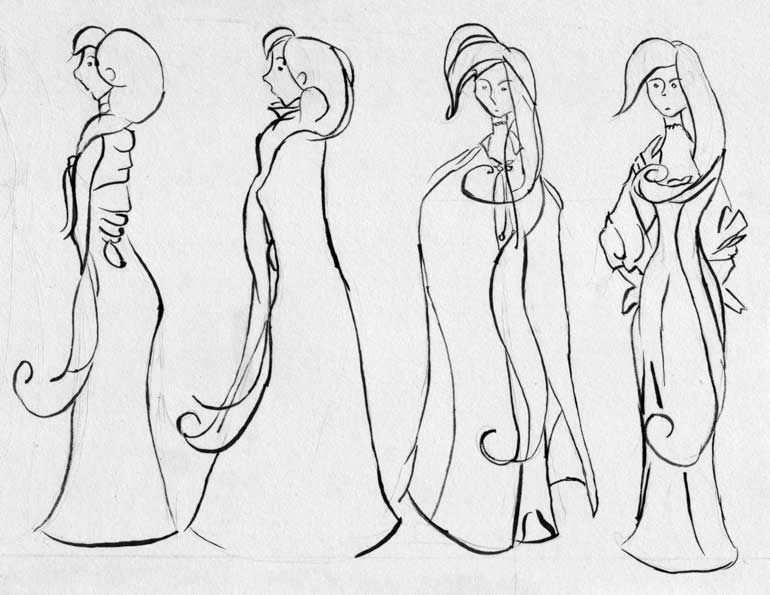
Let me begin my series of filler sketches by going over some character sheets. In the past months, I’ve sketched the characters over and over again. Some character like the Dwarf, or Don came naturally to me. I sketched them down once, thought them satisfactory, and went on my way. Som and Ivan, however, never felt right. Occasionally, I get a frame where I think “yes, this is right. This is what Som should look like.” More often, I flounder about and the only connection from one frame to the next is that she’s the only female caste member. Thus, this week I present a series of character sketches created as I tried to nail down her design.
I spent a lot of time sketching Som because some part of me wants her character to look right and wants her to have the right appearance and a consistent look from one frame to the next. My lack of proper life-drawing skills shines through with her character. While Don and the Dwarf can get away with being abstract boxes and bulbous shapes, I wanted the characters of Som and Ivan to have more realistic proportions which entailed a less abstract approach to their characters.
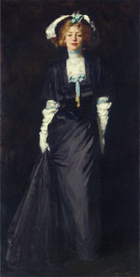
A lot of Som’s clothing is based on Robert Henri’s paintings from the turn of the twentieth century. There is something very sensual about how the woman hold themselves in Henri’s work. They exude a kind of self confidence that makes them seem powerful and seductive. Certainly, this doesn’t fit the personality of Som. However, there will come future female caste members who might embody more of that spirit. Nonetheless, the dresses of that period are so gorgeous in their complexity. I saw Henri’s painting of Jessica Penn while living in Seattle last spring and I instantly wanted to find some way of incorporating that dress into the comic, and behold this Monday, I made it in!
 The
character sheet above is done on standard sketch paper of 8-1/2” by 11” with a
4H pencil then inked with a size #0 Winsor 7 sable brush using Indian ink. I
scanned the image in at 300DPI and 1200DPI using a flatbed scanner. I give
these details only for the more technically minded, but take note of the DPI,
as I found significant changes to the end result based on my initial scanning
resolution. Progressing from right to left I drew Som facing forward and than
profiling the page. The Jessica Penn dress makes its appearance, but I imagine
it will rarely be seen since most of the comic takes place outside and so she
will be wearing her traveling cape through most of the comic. This is quite
convenient as the dress is more time consuming to draw. I am happy with the
results of the profile images as well as the drawing on the far right.
Nonetheless, I am unsatisfied with the front-view cape image as she appears to
be scowling, an effect I didn’t want to create.
The
character sheet above is done on standard sketch paper of 8-1/2” by 11” with a
4H pencil then inked with a size #0 Winsor 7 sable brush using Indian ink. I
scanned the image in at 300DPI and 1200DPI using a flatbed scanner. I give
these details only for the more technically minded, but take note of the DPI,
as I found significant changes to the end result based on my initial scanning
resolution. Progressing from right to left I drew Som facing forward and than
profiling the page. The Jessica Penn dress makes its appearance, but I imagine
it will rarely be seen since most of the comic takes place outside and so she
will be wearing her traveling cape through most of the comic. This is quite
convenient as the dress is more time consuming to draw. I am happy with the
results of the profile images as well as the drawing on the far right.
Nonetheless, I am unsatisfied with the front-view cape image as she appears to
be scowling, an effect I didn’t want to create.